Possible Adoptable? oO;

Post finished and unfinished work here for critique and appraisal.
Post Reply
Shado
Posts: 12
Joined: 18 Feb 2006 01:07 am

Possible Adoptable? oO;

Post by Shado »

Yeah.. Dunno if this would be an Uni or a Horse.. Could be both, I suppose. xD

I just signed up not too long ago, I've been watching this community for who-knows-how-long, and I finally decided, "MUST JOIN!"

And I wanted to get some critique on this horse-thing.. It had really thick lines at first so I spent about an hour with the eraser tool, touching it up as much as possible. :P

I've had it for a while, tis just that school has been getting in the way of me doing virtually anything, and I finally have a 4 day weekend! -dance-

Well, here it is:

Image

Yayy (I think?) Thanks for comments in advance! :D

->Liz

EDIT: I just finished making a custom for my friend. Hopefully it turned out okay? oO;

Wings were based off a butterfly I googled. :P

Image
Hawk
Posts: 338
Joined: 19 Jan 2006 02:18 am
Gender: Female
Location: Probably watching a bird.

Post by Hawk »

Welcome to Neocolours :D

I like your horse/Uni and I think that it looks pretty good, although I don't know very much about horse anatomy :D Something about the front legs looks off to me... maybe it needs knees? They look a little stiff.
Shado
Posts: 12
Joined: 18 Feb 2006 01:07 am

Post by Shado »

Yep, I see what you mean. I need to improve on anatomy. x_x I was just trying to study this one horse picture and apparently I didn't do good enough. :P

Thanks! =D
Illuen
Posts: 1042
Joined: 08 Jan 2006 02:39 pm
Gender: Male
Location: Windurst Residential Area

Post by Illuen »

I know nothing about horse anatomy, but I must say that the head is absolutely DARLING. You seem like a good artist. Only thing that looks weird IMHO is the little dip in front of the hind legs, but that may be common in horses and I am just an idiot.
Image
No spoony bard could spin a sweeter tale.
TCD
Posts: 381
Joined: 18 Jan 2006 07:54 pm
Gender: Female
Location: Hogwarts--Slytherin Common Room

Post by TCD »

Warning: I am no artist.

I took the liberty of making suggestions in MSpaint. Let me remind you once again, I am no artist.

Image

The head was too straight, the actual nose didn't have any definition. The eye, also, is way too big for the face and smack dab in the middle....it's like....crazy mutant horse with eyes that bore into your SOUL. So I shrank that a little and moved it up.

Near the hind legs, the stomach was too high up, so the horse looked...well emaciated, or super-skinny. If that was made more shallow, and the line of the left hind leg extended a tad, it would look less unhealthy.

Image

That's a fairly good horse, though the picture is...eh. GIS for horse and you'll find some good ones.
Shado
Posts: 12
Joined: 18 Feb 2006 01:07 am

Post by Shado »

Thanks Illuen. :D

Yeah, I am not a horse expert, nor have ever seen a horse in person (although my parents claim I have ridden a pony at the carnival once)...

I'm glad the head is okay. I must agree with ya, I think thats the best part of the horse, which is good. :D

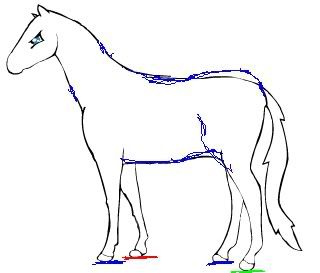
The dip in front of the hind legs (stomach/flank area I think?) well, looking at some anatomy sides (Wikipedia is my friend), there should be a small dip (well, I'm assuming you're talking about how it goes upwards..?), but maybe its because mine looks really unrealistic, or its missing a body part there to fill it in. ^^;;

Thanks for the comment about seeming like a good artist. I'm a slacker and I tend to stop drawing for a long time and then come back at spontaneous times (like today!), but hey, its hard to keep a 13 year old (turning 14 next saturday! :D) to do something for ages... It gets stressful, especially when I'm trying to make it flawless.

Well, here we go. I just finished trying to refine the base again. Added slight knees, made a shoulder, and decreased the little jump in front of the hind legs. :D

Image

EDIT: Oops, I guess I get to change it again. Thanks Cheshire Dragon. :D

EDIT2: There we go, updated the picture here. Hopefully thats better. Except, I won't change the face, just because I like the placement of the giant mutant eye, not trying too much for realism on the face. :D Lets call it my own trademark. -cough- Yeah, thats right. My trademark. :lol:
Hoofs
Posts: 56
Joined: 19 Jan 2006 10:18 pm
Location: In a barn, DUH!

Post by Hoofs »

Image

Well here is my two cents... its body is disproportional to its head. The back is to long, compared to the neck. Here are some proportional guide the head equals one and the back from withers (botton of the neck) should be two heads. ^_^ and legs are about 1.5 heads.

There is no sway in the back which a horse needs for support. A slight sway is needed in the back of your horse. Also its hooves are on three different planes. There should be either 1 or two planes with the pose you've choosen for your horse. They should all touch the same line or the two legs furthest from us in the picture on a different line then the two closest to us.

Over all I LOVE the head and its large misplaced eye. ^_^ And if you make customs I've like one of my uni *hums* Hehe
Image
Shado
Posts: 12
Joined: 18 Feb 2006 01:07 am

Post by Shado »

Poor Hoofs. xD My horse is so anatomically strange, she had to make 50 scribbles! J/k.

Well, here goes again.

Image

I realize the hind-area/butt is kinda pointy.. oO;

Thats no big problem to me, nothing a little eraser tool and brush won't fix.

But, hopefully this is a better base than what I started with? :|

Thanks TONS for helping me out! ^_^ First day at the forums and I've already learned more about horses than I could have if I wasn't posting here.

Well, maybe not, but I'd like to think that. -nod nod-

And I'll definitely open up a request thread, since this one is all.. oO; Crowded with 50 of my horse bases. xD
Hoofs
Posts: 56
Joined: 19 Jan 2006 10:18 pm
Location: In a barn, DUH!

Post by Hoofs »

It looks great!
Image
Fjorab_Teke
Posts: 1716
Joined: 28 Jan 2006 10:38 am
Human Avatar: 271433
Location: Tennessee or Georgia, take your pick
Contact:

Post by Fjorab_Teke »

:shock: Wow, the original looked MUCH better, and unfortunately that Appaloosa picture has too much "background noise" to be a good study on anatomy. And...um...take this from a horse expert who's studied equine anatomy for doing my own art. http://fjorab.5u.com/art.html ... look at the cluster under "Idyll Valley" for some of mine (I plan to redo some and put backgrounds on the ones I'm happy with).

I wish I were more comfortable with doing digital art, and since I don't have a scanner...well, I can't really give many pointers right here.
Shado
Posts: 12
Joined: 18 Feb 2006 01:07 am

Post by Shado »

"the original looked MUCH better"

..?

Wow, your art is lovely. I really like how you color. The one titled after your username (Fjorab_Teke) is really amazing. The pose, colors, and realisticness is cool. -wishes she was good with traditional art-

Thanks, it gives me something to study upon. Too bad I'm taking a break from horses and moving into a project of drawing a Dragon which will probably take me a month to finish. :P Individual scales are evil!
Ziggy
Posts: 345
Joined: 18 Jan 2006 09:36 pm
Location: The pit
Contact:

Post by Ziggy »

Fjorab_Teké wrote::shock: Wow, the original looked MUCH better, and
I have to agree with this. The original had flaws, but nothing glaring. The newer one has many more.
Shado
Posts: 12
Joined: 18 Feb 2006 01:07 am

Post by Shado »

Ziggy wrote:
Fjorab_Teké wrote::shock: Wow, the original looked MUCH better, and
I have to agree with this. The original had flaws, but nothing glaring. The newer one has many more.
>_o

Well.. Alright then. xD Too much changing around with the art.. Now I have to figure out how to revert it back to something close to normal... I accidentally saved over the first base. :x

Thanks. :D
Float
Posts: 272
Joined: 21 Jan 2006 10:33 pm

Post by Float »

Whatever thing is at the way top looks really good. I love it shaded by the way. It doesnt have to be perfectly like a horse either, I think it looked good king of boxy.
jeti
Posts: 93
Joined: 08 Jan 2006 01:03 am

Post by jeti »

Shado wrote: ow I have to figure out how to revert it back to something close to normal... I accidentally saved over the first base. :x
jeti says: Well, I think the thing that makes the original look better is that it flows better as a whole... the problem with the corrected version is that there's too much skewing the original to correct anatomy that simply makes it... well, look skewed. e_e;

I think if you're willing to do so, however, you can probable paste the old & new versions on top of each other on different layers and set the opacities down moderately low so that you can kind've come to a... a middle agreement? Can't seem to remember the proper phrase for what I'm trying to say.

I tried it myself:

Image

Yup. But I don't really know anything about horses, so it may not be that great to take my advice, actually. *laughs* All I know is that they make me stop breathing and that makes me sad. :3

That being said, you can just paste the original into a new canvas and set its layer mode to multiply, and you'll be able to colour it just fine all over again. :3
Post Reply

Who is online

Users browsing this forum: No registered users and 16 guests