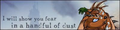
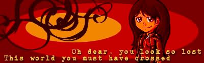
Well, since subetadb's graphics are down for the moment and didn't find anything interesting to use from minionmatch, I decided to create my own forum set. I used lyrics from one of my favorite songs and picked out my two new favorite minions. ^^ Then I just fiddled around with them and the gradient tool in Photoshop. These were my results:
That's my forum set, and I really liked making it. It was really fun, which just makes me want to make even more. xD I even made an avatar to match it. As you can see, I love the new horses. @_@ They're so pretty.
They're quite nice; I particularly like the avatar. One suggestion, though, is to make sure you've got anti-aliasing turned on when you use non-pixel fonts. It looks like you probably didn't, which is why the text is very pixelated and difficult to read. Anti-aliasing will make it smoother. The option for it should be on the toolbar of your program -- maybe a drop-down option on photoshop, I'm not sure.
Its a bit different actually, I think its called texture or something. I can't remember. But it has different options like smooth, strong, crisp, none. There's one more, can't think of it off the top of my head. I wasn't sure if having that option put on it would make it go off the oval, so I made it like that.
It probably is a bit hard to read, I wonder what it would look like with one of those options on. *goes to try it* I'm glad you like it! I certainly do. xD And yeah, the avatar I like as well, but the signature is my favorite.
I don't usually use photoshop myself, but here's a tutorial that I did for my icon community on livejournal about antialiasing. I believe there's a screenshot that one of the other designers made of photoshop's text options, with the anti-aliasing portion circled. It's probably the most common mistake I see in graphics work.
Yep! Looks anti-aliased now. With PS I think that the different options in the drop down menu are just different levels of anti-aliasing, whereas just leaving it at "none" will get you the jaggedness of the first one. Looks really nice now. I like the font a lot -- what is it?
I think there's a way to make text gradiate as well, which might be useful for something like the third one, but I have no idea how to do it in PS. But it might be something to consider looking up for future graphic work if you decide to use gradiated backgrounds.
A Yummy Apology. ^^ I found it off of one of those font sites, I can't remember which. Gradient text? Not sure if that works in PS, since it only takes the foreground color and that's your text color. It would be nice, I had to guess on where it would look the best on the signature. I may make more, depending on if I find more items that would go good together, or ways to make different backgrounds. As I can only make basic shapes, not the neat ones that minionmatch or subetadb can make.
I've never used PS, but there should be a way to change your foreground colour so that it's a gradient instead of a solid colour. Trying clicking and holding on the foreground colour perhaps? That's what it is in psp7, which I'm currently using.
The sigs are all very nice btw, and the av is particularly pleasing.
Ah, but the commas go along with the pauses, if you've heard the song. I know it isn't grammatically correct. xD But it does go with the song and breaks up the measures. And I'm not sure if clicking the foreground will work. All it brings up is the color picker. *has done that many times* Maybe pausing, though I've never heard of that being done. Would be nice. ^^;
If you look at the bottom of your layers palette, there should be a circle with an f in it with a little triangle next to it. That opens up blending options, and one of the options is gradient overlay. You can do all the color, angle and style alterations from there.
Thanks! I knew if you double clicked on the layer, it would give you options for glows and such. I haven't used it very often to remember what is there completely. But I don't know I've ever noticed that under the layers. Learn something new every day. xD