In the happy pose it looks a bit bashful -- the upturned gaze combined with the red markings on the face.
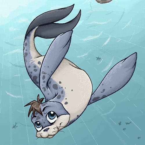
I like it. It could be aerodynamic or hydrodynamic, except for the wings. Why all other Tuskas are lying on an invisible shelf I'll never know. Much less awkward looking creature, here.
Faerie Tuskaninny
Nah, just the aquatic ones, and the Tuska looks much more graceful this way. So would the garden-variety Flotsam; they are primarily aquatic critters, so why not draw them as though they are in the water? (Royal is a good example of this.) Pose 'em the way this faerie is done, or the way the Maraquan Lupe is, and they lose most of their awkwardness.
-
Fullmetal Dragon
- Posts: 463
- Joined: 09 Jun 2006 04:52 pm
- Gender: Female
- Human Avatar: 156401
- Location: Seattle
Hmm. I think I like this, fairly well at least -- I also saw "Faerie Tuskaninny" and braced myself for another pet like the Faerie Uni.
My favorite part is the color scheme, I really like the orangey-yellows and reds together like that. Its hair does look kind of doofy though. XD; I like the markings around its eyes and nose, and the finlike look of the wings.
Of course, I'd probably still never have a Tuskaninny... none of the colors scream out to me that I must have one now omg, but I still like this one. :D

<3
-
thelonetiel
- Posts: 1067
- Joined: 07 Jan 2006 08:56 pm
- Gender: Female
- Human Avatar: 15268
- Location: Nuevo Mexico, Estados Unidos
So was I the only person who was eager to see the faerie tuskaninny? Seems like everyone was expecting the worst. 
I love it, I wish I had room. It stands out from the other faerie pets and looks lovely. Not all faerie pets should be pastels. The wings are goregous, and nicely dynamic in all poses. The hair does look a little like molded plastic, but eh, doesnt detract too much.
I love it, I wish I had room. It stands out from the other faerie pets and looks lovely. Not all faerie pets should be pastels. The wings are goregous, and nicely dynamic in all poses. The hair does look a little like molded plastic, but eh, doesnt detract too much.


-
Mistress Morbid
- Posts: 849
- Joined: 19 Jan 2006 02:33 am
- Gender: Female


-
watermirrors
- Posts: 24
- Joined: 01 Jun 2006 12:59 pm
I like it for the most part. The colours look really nice on a tuskaninny and I love the wings on this. My only complaint is the face, due to the markings there it looks oddly squashed to me, and I agree about the hair needing to be a litttle less...wild perhaps? Besides those two litle complaints TNT have done a nice job of this so thumbs up from me.
Hee, I too thought this was a Maraquan tuska when I first saw it x) That said, the wings are v'awesome, what with the whole aquatic-aerodynamic thing going on.
Unfortunately, that's about all I like =P
Consistency's a bit annoying between poses, no thanks to the magically changing flipper-hands and wing placement. The hair's plain weird, and if, as the poses suggest, the tuskaninny's s'posed to be underwater, why's the toupee so nicely flat on its head?
Speaking of, while the flying-in-water poses are nicely achieved (particularly in the emotion poses), the head's position is becoming increasingly annoying. As others have pointed out, it appears too low, or too far from the body, or /something/ - ultimately making most poses appear somewhat beheaded. I can almost see the artist sketching the sad pose first, and then working off that for the others, as the head's position seems suitable only for said pose.
The colours used are a nice deviation, but not particularly appealing as far as I'm concerned =P The wings, again, are purdy enough though. The markings on the tail are neat; those on the face, not as much. Hopefully someone can point out the colouring's based off some sort of aquatic/faerie thing, because I really want to have a reason to excuse the artist =P
Lineart's a plus, though, and overall artistry is appreciable, so in this case I say yay wings and artistry, nay pretty much everything else =P

Thanks to Twisted for the awesome set!
-
TraditionsRule
- Posts: 61
- Joined: 13 Jul 2006 02:35 pm
- Gender: Female
- Location: US
Who is online
Users browsing this forum: No registered users and 41 guests