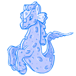
Kudos to the artist for making this a true sponge and not just a magical shapshifting 2D pet. The color is a bit off though and gets lost in the blue of the circle pose. In fact, there's really not enough shading and contrast overall.
I think this is a nice colour for the Peophin. The shape and poses are sleeker and avoid some of the clunkiness that has bothered me about the Peophin for a long time.
I agree that the colour could be a bit darker or have more contrast/shading.
Aww, I think it's adorable. It is a little light, but it's a nice shade of blue. My only real issue with it is that it's not the revamped Peophin (so the hit pose is still a bit...bad), so otherwise it's a very nice colour.
I actually really like the shade of blue used here, it's very soft and lovely. I also like how they did the tail, splitting it into flat pieces. It's nice, though slightly disheartening to see no indication of a revamp.
Heeee... it's actually flat and spongey! Nice job. I especially like what they did with the tail and ears. Cute shade of blue, too, and the face seems ever-so-slightly redrawn from the normal Peophin.
I like the slight face redraw - facial expressions are much softer and brighter than on regular peo.
The shade of blue they picked is nice, but I'm not convinced it works in this case - it makes it a lot harder to spot the outlines.
I like the fact that it's nice and flat and looks like a sponge - and no bandages in the beaten poses! Whoo!
I think, though, that Peophins are getting a little screwed. They get a crap electric color, and then a lab-only color that's well... sponge. I don't think its a BAD color, when done right (ie sponge aisha = love), but it's not the most exciting thing in the world.
I have to agree though, I think the color is a BIT flat. I like the shade itself, but it needs... something.
This is <i>bizarrely</i> good. Really my only problem with it is that it's too similar in color to the circle pose ring, and I don't actually dislike the color, so that's only a problem in that one pose.