That's because I failed to update some paths a while back.
It has been fixed, but the scripts that recreate the RSS feed run only when new colours are being detected, which no longer happens during the weekend. I'll force one now, and it should no longer be a problem from now on.
Frontpage and all that
-
thelonetiel
- Posts: 1067
- Joined: 07 Jan 2006 08:56 pm
- Gender: Female
- Human Avatar: 15268
- Location: Nuevo Mexico, Estados Unidos
Okay, I finished a very basic layout, quite simply a DIV, Table, and a style sheet based around this banner.
What are we going to do about the front page? Are we going to hold a more official contest for the front page? Or are we just not going to worry about it for now?
I guess I'm just impatient to see the site be pretty. x)
What are we going to do about the front page? Are we going to hold a more official contest for the front page? Or are we just not going to worry about it for now?
I guess I'm just impatient to see the site be pretty. x)

-
bonecrivain
- Incorrigible Bookworm
- Posts: 1324
- Joined: 18 Jan 2006 09:41 pm
- Gender: Female
- Human Avatar: 157826
- Location: wandering
-
Kamil
- Not the nice one
- Posts: 1788
- Joined: 08 Jan 2006 02:47 am
- Gender: Female
- Human Avatar: 72834
- Location: the comfy chair
- Contact:
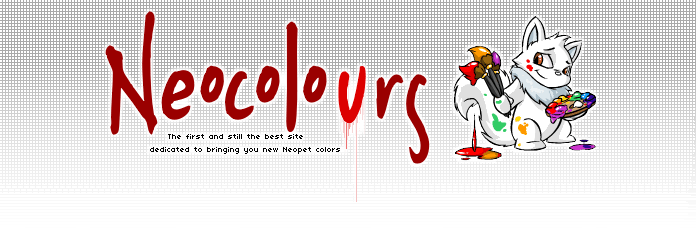
I love it too, you did a wonderful job, Tiel. Very shiny!Huggles wrote:Oooh, I like it too. I think the logo needs to be a bit more colorful. Different coloring for each letter, not quite pastel, but light enough for the U to stand out. It looks like dried and wet blood at the moment, which isn't necessarily bad.
And, heh, I'd noticed the fresh/dried blood coloring too, and I actually like it; I'm thinking of it as subliminal advertising. =D


MM and Twofold rock, yo.

-
Jazzy
- Devil's Advocate
- Posts: 2038
- Joined: 04 Jan 2006 06:06 pm
- Gender: Female
- Location: a g-orbital
- Contact:
If we do bring my banner back, I'm going to update it slightly first- not much, but you've no idea how irritating it is to see random blank pixels in it when you know you still have the layered file for it and can't do anything about it 
Oh: also, the new layout should not be too graphically intensive. Ideally, we'd have a small banner, and things like dividers would be made out of HTML and not images. Right now, we use a gig of bandwidth a day- we can increase that to a gig and a half or so before kamil has to change plans, which I'd like to avoid if at all possible.
Oh: also, the new layout should not be too graphically intensive. Ideally, we'd have a small banner, and things like dividers would be made out of HTML and not images. Right now, we use a gig of bandwidth a day- we can increase that to a gig and a half or so before kamil has to change plans, which I'd like to avoid if at all possible.

Who is online
Users browsing this forum: No registered users and 36 guests