Page 2 of 4
Posted: 04 Oct 2006 12:05 am
by Settingshadow
My first reaction to the Faerie grarrl was: "So *that's* what happens when you eat a Faerie Pteri...interesting"
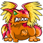
And pretty much, I stand by that. It looks like a grarrl is trying to morph into a Pteri, with little Pteri wings pushing the skin on it's back and the Pteri tail having bust through its own tail.
Did I mention I'm not loving it? My major complaint is that the wings seem very small for it, and the seem to change size and shape between poses
Also, the head looks pasted on in pretty much every pose and the lines on the head details (horns, whiskers) are very thick for what should be delicate details.
Pink is pink. It looks a lot like a subdued version of Barney, but, well, Grarrl, so I suppose that's to be expected. I love a lot of the Grarrl redraws, but really less so the original.
Posted: 04 Oct 2006 12:14 am
by Usul_Princess
I have to agree with Slugawoo when she said that the fatness of the faerie grarrl is a bit of a turnoff. And the chunkiness factor isn't necessacarily what's ultimately wrong here. (I mean, they managed to make the faerie yurble very adorable, and it's kinda chubby) But I think I don't really like it because there's too much going on in one pic/frame. Everything is so smashed in, that looking at it makes me think some resizing is in order. I, like everyone else thought "Oh God" when I read "faerie grarrl", but it's certainly not as bad as I thought. Mabye a better color would fit nicer too like the colorscheme of a faerie seti for a more "masculine" pet. I was also hoping that a faerie grarrl would look something along the lines of a faerie niptor, but no such luck.

Pink is a little too dark, but I really like the darker shades as opposed to bubblegum pink, so yayness.
Posted: 04 Oct 2006 12:57 am
by Monkeyguy
I don't like the whiskers on the faerie, but everything else is great.
Posted: 04 Oct 2006 02:30 am
by Whitewolf
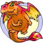
The faerie grarrl seems a little too chubby too me, I'd like it a lot better if it were slimmer, like the darigan draik. It'd be nice if the whiskers were a little longer and elegant, but overall I love it ^^ The happy and circle poses look a little wierd, but I definantly plan on getting one :3
Posted: 04 Oct 2006 02:40 am
by Gibblywibbly
Pink is.. well, it's Pink.
I do like the Faerie Grarrl, simply because, well, folks.. it's a faerie Grarrl. And it's just a total fatass, too.

Posted: 04 Oct 2006 03:04 am
by PharaonicQuiche
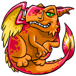
Eh. Faerie's alright but nothing especially thrilling. I don't like how the whiskers turn up on the happy pose. Can't get the image of an uppity French chef out of my mind because of it?

And the uber-chub isn't exactly eye candy material, either. Nice colours, though. At least it wasn't a case of, "Now your grarrl can be painted PINK or PINK with WINGS."
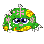
Pink is... a very fine shade of pink. Smooth and pink. I like the green pink combo thing.
Posted: 04 Oct 2006 03:26 am
by Cyaneus
Whoah. Totally unexpectedly--the Faerie Grarrl is an instant must-have for me. I love it. That's all I have to say.
Posted: 04 Oct 2006 04:10 am
by huyet
I like the look of this pet. You're right though. The happy pose is kind of freaky looking. I only have space for one more pet, so I don't know if this would be my number 1 choice for the final spot on my account.
As for pink, well at least now you have the option of choosing pink as a color for your Grarrl I guess.
Posted: 04 Oct 2006 05:32 am
by Randomness
I like the faerie i love the colours used and the angry pose is just adorable:D

With the pink the colour is just the same as the skeith and i don't like it.
Posted: 04 Oct 2006 05:36 am
by gidget
Heh!
In the happy pose, that Grarrl looks like he's been hanging out a little too much with the Disco Kiko in smoke filled rooms.


Posted: 04 Oct 2006 05:48 am
by Fjorab_Teke
The horns are messed-up everywhere despite looking nice singly (as in, not comparing poses and not with the other horn for reference), that's what the big turn-off for me is. The curled-up lower feet, while appropriate while flying, look wrong tome somehow...or simply weird. But the stylization is still better than the normal Grarrl's feet. The colors hurt my eyes a little, but that's simply because I don't like any of them at all, but the effect of them together like that is admittedly well-done.
Otherwise, I'm very pleasantly surprised by this color. I saw the new color before I saw this thread (both on NC main and on Neo) and wondered if there might have been a slight possibility of it being Shenkuu-colorish instead...but no it has the Faerie tag.
Posted: 04 Oct 2006 06:25 am
by Huggles
I wish they had taken the time to fix the chubby Barney feet and given them proper claws like Darigan or at least make them somewhat plausible for a freaking dinosaur. The same goes for the hands/paws to a lesser extent. Still, it is so much more than I was expecting. I think the yellow is a bit odd when it's right next to the pink. I dunno. It's nice overall.
Posted: 04 Oct 2006 07:26 am
by Paint

Ahh, I love this pose. I didn't even notice the green eyes until someone pointed them out, so not bothered by them. I love the colours and the tail. Overall, good pet. I'd keep it if it zapped it. 9/10
Posted: 04 Oct 2006 08:06 am
by lavender
My first reaction was, "what's with the horns?" They seemed out of place, imo

Overall, I don't like it. :

:
Posted: 04 Oct 2006 08:26 am
by phoebemittens
I do not like faerie. It could be worse, but.
1. the green eyes, which are horrible, horrible.
2. the pasted-on head in the happy pose - the HAPPY pose, the one you see all the time! And it's awful!
3. The shading on the orange parts, which appears darker in the circle pose and lighter in the hit pose (minor quibble)
I like the horns, and the plasticity of the other poses - overally I nearly like it, but I can't get past points 1. & 2.
