DM Kumos and Fester Revamps

For posting new and revamped pet colours on Subeta.
Jessi
Posts: 3413
Joined: 09 Mar 2006 06:29 pm
Human Avatar: 155904
Location: Seattle, Washington
Contact:

DM Kumos and Fester Revamps

Post by Jessi »

ImageImage
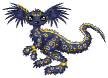
Well. I have to say, I am blown away by the Kumos. It's a pet I've wanted for a long time and never got because I knew it'd get revamped sooner or later. And actually, now I kind of wish I had an idea for one again xD It came out quite lovely. I think it kept a lot of the feeling of the old pet and fixed the anatomy. It's really beautiful - great job, Arbor!

Slipping in with a quick edit to say there is one thing about the DM Kumos that bothers me - its front feet don't look completely grounded. It looks like its leaning really far to the left (its left) and it might fall over xD

ImageImage
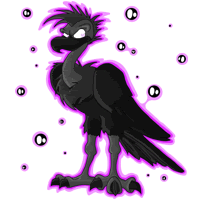
The fester, I'm less impressed with... not just because it's a Fester, either. It's just... An awkward pose. And the white mohawk thing just stands out a LOT to me. The tummy is so dark it's hard to see the feet. I dunno. I don't like Festers, really, so I don't have much of an opinion anyway xD
shadowgem
Posts: 63
Joined: 01 Nov 2006 05:01 am
Gender: Female
Human Avatar: 71636

Re: DM Kumos and Fester Revamps

Post by shadowgem »

Fester is alright. It's a Fester. The feathers are really pretty, but I just don't care for the species.

The Kumos looks fat, but that's probably just because I'm used to the super-skinny old version. I kind of liked the long-legged, slender maned wolf look the old one had going, but I know it wasn't consistent with the species, so it had to go. The new one is an improvement, art-wise. I'll probably still never own one because I'm not really a Kumos fan either, but I think Arbor did a great job balancing the old look with the updated art.
neopets (still full of fail) ~:~ subeta
Avatar drawn for me by Subeta user SHOZZYKiNS
Seerow
Posts: 2793
Joined: 19 Jan 2006 08:47 pm
Gender: Female
Human Avatar: 155383
Location: Mystery Island
Contact:

Re: DM Kumos and Fester Revamps

Post by Seerow »

The new DM Kumos is so much nicer then I ever thought it could be, so some serious grats goes out to Arbor for trying to keep as much of the old that she could. The old DM Kumos didn't look anything like a Kumos and I'm impressed by how much of the feel of the pet was kept. I'll still be using the old image as an overlay for Jesaiah as it fit his character more, but this is a lovely piece of art.

The Fester I'm not quite sold on. I don't know what it is, but it just seems off somehow. The colors are very saturated and fake looking.
Wanna donate towards my drink gallery, the Golden Goblet.
bonecrivain
Incorrigible Bookworm
Posts: 1324
Joined: 18 Jan 2006 09:41 pm
Gender: Female
Human Avatar: 157826
Location: wandering

Re: DM Kumos and Fester Revamps

Post by bonecrivain »

I moved the old poses into the first post, for easier reference. Thanks, Seerow!

Seeing the old and new Kumos side by side, I definitely prefer the darker colors of the old version. The neck was weird, of course, and I understand its elegant lankiness doesn't match the other Kumos colors, so I expected a pretty heavy revamp. This one is actually more true to the old art than I'd expected, but there's something about it that I don't quite like. The face, maybe--it seems too short, although that doesn't really make sense. I think it just lost the noble, haughty head-tilt of the old one, and since I had a vague pet personality idea connected to that, I have trouble seeing the new one with purely objective eyes.

It is very grey, though. I don't think I would have noticed that without the old one for reference. I also liked the big, bushy, sweeping tail. I'm also not sure about the left ear -- it seems to be at a bit of an odd angle.
Sunwolf
Posts: 442
Joined: 07 Jun 2007 11:04 pm
Gender: Female
Human Avatar: 36334
Location: Vancouver (no, not Canada)
Contact:

Re: DM Kumos and Fester Revamps

Post by Sunwolf »

Wow, the Kumos revamp is fantastic - love the expression and the soft-looking grey and black fur and the "I'm scared" ears. It looks a tad stiff, but then again, it's frozen with fear. I must get one immediately. Excellent work as usual, Arbor!

The Fester - I usually forget that they exist. I'd love the species a lot more if it didn't have the ugly bald vulture head and the punk kid mohawk. If it was a moehawk-less vulture it would be better, or even some sort of eagle instead. This one's mohawk color is very distracting, and I wish we could see more of the talons - my monitor shows them as a black blob.
My computer is connected to the internet and the internet contains everything in the whole wide world ever. I don't know about you but I sometimes find everything in the whole wide world ever a bit distracting.
Dollfie
Posts: 100
Joined: 31 Mar 2007 10:55 am
Gender: Female
Human Avatar: 227963

Re: DM Kumos and Fester Revamps

Post by Dollfie »

I love the DM kumos revamp so much. The shading is so well done and it looks so soft. My only nitpick is that it looks a bit scared or at least unsure in the eyes. If they had been narrowed a tiny bit like the reborn version, it would be perfect for me. I could easily get over that though if I had a pet idea in mind for the species/color. I am now convinced that Bellaius is going to be a kumos sooner or later, probably angelic, because of the awesome work Arbor has turned out.

The fester's update is a vast improvement in art quality. Yep.
Enriana
Posts: 560
Joined: 18 Jan 2006 09:31 pm
Gender: Female
Human Avatar: 155464

Re: DM Kumos and Fester Revamps

Post by Enriana »

I agree with Bon - although the revamp was necessary, I'm not quite sold on the new one. There's nothing wrong with it - it's very well drawn and not too dark and neat. But the whole expression/mood/air of the old one isn't the same - the old one looks very regal, haughty, almost disdainful. The new one looks more dazed, blank, and inquisitive (odd combo).

I'm a Fester fan - I have a Reborn one - but the DM one isn't so hot. I like the mohawk - the whole head is awesome. However, from the neck down, it's simply much too dark. Part of this might be my monitor, but the detail of the wings is completely lost, as well as the details of the feet/tail area. It's just all black, no contrast, and it makes me sad 'cause it could've ROCKED. Instead, it half-rocks (because the expression, face, head and ruff are great).
Fuzzy
Posts: 71
Joined: 08 May 2007 01:00 am
Human Avatar: 7837
Location: In a bush

Re: DM Kumos and Fester Revamps

Post by Fuzzy »

The fester is nice. The wings look strange, but I'm not really sure just what it is. I think the mohawk would stand out less if there was more white on the body to balance it out. Otherwise, this was a much needed revamp.

The expression of the new kumos is keeping me from really liking this revamp. The eyes look sad or surprised, and the ears turned back make it look scared. I would like it better with fiercer look. It's very well drawn, and is an overall improvement; however, I'm still not 100% with it.

I made some small edits to better illustrate what I mean by fiercer
Image
Wingsrising
Posts: 2682
Joined: 18 Jan 2006 09:31 pm
Gender: Female
Human Avatar: 157670
Location: Iowa, USA, trying to stay warm

Re: DM Kumos and Fester Revamps

Post by Wingsrising »

I'm pretty indifferent to the DM Kumos in general so I'm not fussed one way or the other. However...

I think the new one is good, but although it kept the basic pose it seems to have changed the expression somewhat. I agree the new one looks less disdainful and more blank, In addition, the new one seems less -- poised -- if that makes sense.

It reminds me vaguely of the Lupe revamp on Neopets -- improved the art greatly, lost the "poise" of the old art.

Still, if the DM Montre revamp changes this little, I'll be pleased.
Image
Elzaim
Posts: 230
Joined: 11 Jun 2007 09:14 pm
Gender: Female
Location: Canada
Contact:

Re: DM Kumos and Fester Revamps

Post by Elzaim »

'm really not happy with the DM Kumos revamp. As Bon and Enri have stated, most of the personality that I loved from the old version is not there anymore, and I'm dissapointed at how thick it seems. It's just way too bulky and big - I much preferred the sleek, lean version. Maybe it's just me, but the new Kumos reminds me of a big burly german shepard/lab mix when it should look more like a wolf? My poor, poor Silvanesti... he's lost his grace, elegance, dark, rich color, haughtiness and long flowing tail. :( I'll most def. be overlaying his image on my profile because I can't bare to look at him this way, let alone get rid of him or change him. He was one of the first pets I owned, and after the Keruibi's was what drew me to the site.

The fester I can't really cretique. I suppose it's ok, but I'm not a fan of the species as a whole. It's a blask fester with some dark matter around it. Meh.
Seerow
Posts: 2793
Joined: 19 Jan 2006 08:47 pm
Gender: Female
Human Avatar: 155383
Location: Mystery Island
Contact:

Re: DM Kumos and Fester Revamps

Post by Seerow »

Elzaim, this thread might interest you: Clickie

It has a link to a FF add on that lets you replace any image on any site with any other image. Basically it's an overlay you see everywhere :P
Wanna donate towards my drink gallery, the Golden Goblet.
TCStarwind
Posts: 1119
Joined: 26 Jul 2008 09:56 am
Gender: Female
Human Avatar: 99635
Location: USA
Contact:

Re: DM Kumos and Fester Revamps

Post by TCStarwind »

The kumos is a pretty good revamp. Not sure about the curled-back ears or the wide-eyed expression, but they're not glaring enough to make me dislike the pet.

The fester I'm not sure about. Its wings look very thick, and the image is very grey, but I like the pose. It looks a lot better now that I'm on a different computer with a better monitor and without the sun glaring off the screen. But it'll probably be too dark for my laptop screen. But it's awesome that they finally got rid of the original colorfill pose.
mellaka
Posts: 1055
Joined: 11 Jun 2007 03:33 pm
Gender: Female
Human Avatar: 48736
Location: philly, usa

Re: DM Kumos and Fester Revamps

Post by mellaka »

I appreciate that the artist tried to stay as true to the original DM Kumos as possible, and the revamp really is very pretty, but I have to agree that the change in expression is disappointing. I'm not sure if I'm going to look into coding for the overlay or change my pet altogether but it's no longer a must-have pet for me.

It makes me a little sad because to me it was one of the prettiest pets on the site and maybe the second pet I ever potioned. I guess I'll give it a few days or weeks before I decide what I'm going to do. (I'm leaning toward DM Cadogre since that reminds me of the old Kumos in attitude for some reason, but I think I'm going to wait to see what happens to my equally beloved Graveyard Kumos and Kora this Halloween season before I make any changes.)
Pyrostatic

Re: DM Kumos and Fester Revamps

Post by Pyrostatic »

I want to like the new DM Kumos, I really do, but I just feel like it was rushed. To be honest, while I do love the old one's pose, I think a completely different pose should have been done. Something similar to the DM Kerubi. I am disappointed.
But as for this new one, the legs, especially that front right, look too thick for my liking. I want them skinny, but not as skinny as the old one. The snout is too round. The eyes look too round. The head in general is to round. And the chest fur is not as fluffy as the old one. I wish the neck fur was more fluffy too. It looks too well-kept.

Maybe it'll grow on me, but for now, I'm going to keep using the old one as my overlay for Elfric. I guess I had high expectations for the revamp. I'm sorry. =/

And the Fester, I do not care for. I'm so glad it was updated, but it looks too dark to where you can't see the details from the lower chest down. And what the devil is up with that mohawk? o_0
Kamil
Not the nice one
Posts: 1788
Joined: 08 Jan 2006 02:47 am
Gender: Female
Human Avatar: 72834
Location: the comfy chair
Contact:

Re: DM Kumos and Fester Revamps

Post by Kamil »

The Kumos redraws were one of the things that drew me to the site -- not so much with these new ones. I appreciate that Arbor made an effort with this one to keep the old one's personality, but it just isn't the same feel on a fat lard of a mongrel as it was on a sleek sighthound.

Do not want. >.<

The Fester's kinda cool though. I love the mohawk and I like the eyes a lot. Aside from that, what are ya gonna do? It's a fester.
Image Image
MM and Twofold rock, yo.
Post Reply

Who is online

Users browsing this forum: No registered users and 40 guests