Page 4 of 6
Posted: 04 Mar 2006 08:58 am
by Umbreonmog
I saw this in the news, and said to myself, "That's kind of a nifty Halloween Gelert."
Then I went to Neocolours and saw what it was, and said "That's a pretty shitty Darigan Gelert."
Posted: 04 Mar 2006 11:57 am
by Guest
I know that a lot of people like the red but it just looks too.... ketchupy?
Posted: 04 Mar 2006 12:02 pm
by dunx5000
It's just... ew. no, more than that. It just sucks!
Where's that mutant gelert, TNT? You know that's what should've been released. Bah >=|
Posted: 04 Mar 2006 12:07 pm
by sassa_wiz
i don't like it. As some people said it's wayyy to cartoony, and i thought that the darigan gelert had so much potential.
But i do like the beaten pose.
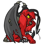
Get me away from the light. Hissss
Posted: 04 Mar 2006 02:48 pm
by Xelio NLI
Aww, lookit, it's a very special Halloween episode of Scooby Doo. It's his trying-to-be-evil cousin, Scary Doo. Sadly, that was my initial thought and judging by others replies that it's too cartoony, I'd say I'm with the majority.
Posted: 04 Mar 2006 03:42 pm
by Strawberry Limeade
AngharadTy wrote:(Didn't Pluto go to hell once or something, and he looked like a devil?)
Devil Pluto
Heck, I think that looks better than the Darigan gelert. Points for not making it purple, but that's the only good thing about this pet.
Posted: 04 Mar 2006 04:00 pm
by Trick
I am so disappointed this pet was released, but not for the same reasons as everyone else. I really really like this pet in every pose but the oh so important happy and circle poses. This latest pet has really convinced me that for some pets at least they have different artists doing the battledome poses and emotion/other poses.
I really hope they fix the happy and circle poses to look as good as the others because if they do I am rushing out to get one of these. Considering they are Darigan pets it wouldn't even hurt to use the angry pose for the circle (and happy pose) like the darigan scorchio has - crappy edit:

Change it to that tnt and I will love you forever.
Posted: 04 Mar 2006 06:38 pm
by Settingshadow
I really hate the face -- the spiky things on the side look like really stupid side burns.
The first thing I noticed about this pet were the magically changing wings between poses, and then I noticed this:
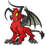
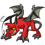
On the left we have happy: large wings, small ears, small hair fwop
On the right we have angry: small wings, gigantic ears, large hair fwop
WAY too fast -- no consistency = bad pet.
Posted: 04 Mar 2006 07:03 pm
by Erstin
hm I didn't really like it.. no, I hated it!
It's very cartoonish, bad drawn.. 1/10
Those small~big wings are *very* annoying

Posted: 04 Mar 2006 08:15 pm
by Monkeyguy
Settingshadow wrote:I really hate the face -- the spiky things on the side look like really stupid side burns.
The first thing I noticed about this pet were the magically changing wings between poses, and then I noticed this:
On the left we have happy: large wings, small ears, small hair fwop
On the right we have angry: small wings, gigantic ears, large hair fwop
WAY too fast -- no consistency = bad pet.
This doesn't bother me that much. It just looks like the artist tried perspective and it didn't turn out all that well. I'm not going to hold it against them.
Overall I do like the pet. The only reason everyone is associating it with Halloween is because red = devil in our minds. If you look past the connotation that goes with red it's not that bad (at least for me).
Posted: 04 Mar 2006 08:26 pm
by RH
My first thought was "ew, they could've done way better on this." but the more I look at it the less I'm bothered by it. I wasn't really looking forward to Darigan Gelerts anyway and it's way out of my price range. I am still disapointed that we didn't get the Mutant Gelert. Ah well it looks like they're going to let it sit on the server for ages just like they did the Darigan Pteri.
Posted: 04 Mar 2006 09:35 pm
by Lou
This would've been better if the artist hadn't used the original poses.
5/10, I like the design but the use of the same posing sadly ruins it.
Edit: I HATE THICK LINES!
Posted: 04 Mar 2006 09:48 pm
by Guest
Been lurking here a while, but this travesty pushed me over the edge into posting

TNT has really ticked me off this time. As a battler (and staff on a popular tourney forum) I don't think its too much to ask to have a nice-looking color for a battle gelert. Like some of you have said, this concept should have been easy to pull off, and I really wanted to like it. And to add insult to injury, they don't release Mutant. :evil: It's got issues too, mainly the color, but I'd take it any day over this.
Posted: 04 Mar 2006 11:46 pm
by Kuroro
Monkeyguy wrote:Settingshadow wrote:I really hate the face -- the spiky things on the side look like really stupid side burns.
The first thing I noticed about this pet were the magically changing wings between poses, and then I noticed this:
On the left we have happy: large wings, small ears, small hair fwop
On the right we have angry: small wings, gigantic ears, large hair fwop
WAY too fast -- no consistency = bad pet.
This doesn't bother me that much. It just looks like the artist tried perspective and it didn't turn out all that well. I'm not going to hold it against them.
Overall I do like the pet. The only reason everyone is associating it with Halloween is because red = devil in our minds. If you look past the connotation that goes with red it's not that bad (at least for me).
I was associating it with halloween, because of the similar beaten pose.
Posted: 04 Mar 2006 11:51 pm
by Monkeyguy
I shouldn't have used "only", I do it all the time when writing essays too. Should have said "One of the reasons."