Revamped Dark Matter Dragarth and Montre
-
- Posts: 2682
- Joined: 18 Jan 2006 09:31 pm
- Gender: Female
- Human Avatar: 157670
- Location: Iowa, USA, trying to stay warm
Revamped Dark Matter Dragarth and Montre
(Old on left, new on right).
Well, the revamp I have long been dreading is here... the Dark Matter Montre. It's not as bad as I had feared, but I still like the old one better. It had an elegance in bearing that the new one, with its awkward head, lacks. The body is fine but the head... not so much.
So while I don't feel I need to find something else to morph Shadowdance into... I will be using the old image as an overlay.
EDIT: Anyone have an image of JUST the old the old Montre instead of both side-by-side I can use for said overlay?
Re: Revamped Dark Matter Dragarth and Montre
Just a note, I think you posted this to the wrong board. :P
The dragarth is better, its face as a bit odd before. I think the montre still has kind of a strange pose but the limbs and wings definitely look better now. I think the only thing wrong with the face is that the muzzle angle feels kind of off, or the eye is too far onto it.. Not sure.
-
- Secret Ninja Mod
- Posts: 1382
- Joined: 19 Jan 2006 03:42 am
- Gender: Female
- Human Avatar: 166931
- Location: Rose Town, Johto
- Contact:
Re: Revamped Dark Matter Dragarth and Montre
I moved it, no worries!
Just woke up from nap, no coherent thoughts on the revamp yet.
-
- Zombie Queen
- Posts: 5251
- Joined: 08 Jan 2006 05:20 am
- Gender: Female
- Human Avatar: 89833
- Location: Tyland
- Contact:
Re: Revamped Dark Matter Dragarth and Montre
Here you go, Wings.
The new one is pretty good; I like it when I look at it alone. But look at them side by side... I'm sorry, I have to go with the old. It's partly because it's a classic, but partly just a style that I guess I like more. There are so many lines on the chest now, it looks busy. I know that's Subeta's thing, to put squiggly lines in the middle of a fluffy thing, but I don't care for it myself.
The dragarth, on the other hand, is 1000% better now.
-
- Posts: 2682
- Joined: 18 Jan 2006 09:31 pm
- Gender: Female
- Human Avatar: 157670
- Location: Iowa, USA, trying to stay warm
Re: Revamped Dark Matter Dragarth and Montre
Oops, where did I post it originally?
That was my experience, too, Ty. When I first saw the new Darkmatter Montre I thought, "Oh, that's pretty good." But when I looked at it side-by-side with the old one I saw how much of the old expression had been lost.
-
- Secret Ninja Mod
- Posts: 1382
- Joined: 19 Jan 2006 03:42 am
- Gender: Female
- Human Avatar: 166931
- Location: Rose Town, Johto
- Contact:
Re: Revamped Dark Matter Dragarth and Montre
In the neopets colours section :D
-
- Posts: 3413
- Joined: 09 Mar 2006 06:29 pm
- Human Avatar: 155904
- Location: Seattle, Washington
- Contact:
Re: Revamped Dark Matter Dragarth and Montre
I'm not in the mood to give a huge critique about these because it'll be a bit biased - mostly because I'm pissed off at some people on Subeta saying things like Lindsey deserves to be fired and never work for Subeta again because of her art. I will say, however, that I love both of these, ESPECIALLY the Dragarth, which I think has a gorgeous face and I can't wait to get one.
-
- Posts: 2793
- Joined: 19 Jan 2006 08:47 pm
- Gender: Female
- Human Avatar: 155383
- Location: Mystery Island
- Contact:
Re: Revamped Dark Matter Dragarth and Montre
I adore the new Dragarth, I love just about everything about it. I kinda wish it had kept the lighter chest fur, but it still looks fine now. Lovely lovely revamp.
The Montre is also very nice, though I agree the head does look somewhat off. I love the new body and wings, Lindsey did such a great job with the purple highlights on them. And I agree Jessi, some of the reactions by people are disgusting.
Wanna donate towards my drink gallery, the Golden Goblet.
Re: Revamped Dark Matter Dragarth and Montre
I've always thought the Montre had a really awkward pose. No changes there, and it looks very squashed into the box now. I still don't care for it.
My first thought on seeing the Dragarth was that it had a tiny head. Seeing the two side by side makes me realise the old one was the same. xD I liked the more blank eyes of the old one and I keep on thinking the curve at the top of the front leg is the actual bottom of the wing joint so that looks off to me until my brain kicks in. But I do like the revamp.
Re: Revamped Dark Matter Dragarth and Montre
I like the Dragarth, I too really like the purple highlights. They look a bit eerie, which is just right.
As for the montre, it is pretty, but I can see why you like the old one better Wings, it seemed to be dancing more. For some reason the new one looks pretty solid, while the old one seems to be mid leep. (if that makes sense to anyone but me)
I don't even have anything coherent to say about that. I'll go over and ad some positiveness later. Maybe subeta should have a "try to be an artist" day and everyone can come and get hated on for a bit. I mean, I believe in honest critique, but that isn't it.
Maybe you should give Lindsey and extra hug from all of us
As for the montre, it is pretty, but I can see why you like the old one better Wings, it seemed to be dancing more. For some reason the new one looks pretty solid, while the old one seems to be mid leep. (if that makes sense to anyone but me)
Buh?mostly because I'm pissed off at some people on Subeta saying things like Lindsey deserves to be fired and never work for Subeta again because of her art
I don't even have anything coherent to say about that. I'll go over and ad some positiveness later. Maybe subeta should have a "try to be an artist" day and everyone can come and get hated on for a bit. I mean, I believe in honest critique, but that isn't it.
Maybe you should give Lindsey and extra hug from all of us
-
- Posts: 96
- Joined: 21 Jan 2006 01:41 am
Re: Revamped Dark Matter Dragarth and Montre
Maybe Subeta should moderate their forum and have a policy against personal attacks.
-
- Posts: 3413
- Joined: 09 Mar 2006 06:29 pm
- Human Avatar: 155904
- Location: Seattle, Washington
- Contact:
Re: Revamped Dark Matter Dragarth and Montre
Well. Subeta's always had a pretty open policy about their forums, but it's irrelevant - the nastiest comments about her needing to be fired were made off-site on tumblr, anyway.
-
- Posts: 165
- Joined: 04 Jul 2008 09:52 pm
- Gender: Female
- Human Avatar: 264619
- Location: that casino plagued city of Las Vegas
- Contact:
Re: Revamped Dark Matter Dragarth and Montre
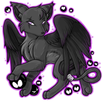
It's a shame when a revamp for one of the most popular species has to turn sour like this. Overall I like both of these but I can see where the complaints are coming from
with the montre. I had to look at it for a minute or two and compare a few things but I know what's bothering me now the most. It's the left side of the face and the line
that's coming down to the chest from the neck. It looks very odd the way it's drawn and makes the montre as a whole look very off model.
Also please don't think i'm taking a shot at Lindsey's art when I post this since these are just a few tweaks I did myself for things that were specifically bothering me. I love
her art very much, I just think this montre has a few flaws that could be adjusted. Basically I just moved the left eye down and made it a tad sharper and removed the neck line
which was my biggest gripe with the whole pet. The rest of the pet is SUPER GORGEOUS though, especially those wings *-*
also i'm sorry Lindsey had to be at the front end of such terrible comments like that jessi, that's extremely rude and uncalled for.
Who is online
Users browsing this forum: No registered users and 27 guests