Page 3 of 4
Posted: 07 Sep 2006 07:27 am
by AngharadTy
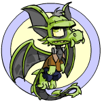
That one I like. Yesyes. It's the shopkeeper in Animator's gallery. *snugs the poor thing*
Posted: 07 Sep 2006 09:28 am
by Kantark
I actually like this quite a lot, I think it's well drawn and, while admittedly not exactly the most original concept on the planet by a long way, it's a fun Halloween-day colour. Especially liking the rolling eyes and expression in the Circle pose and the virtual monobrow.
Any Draik would be happy to dress up like this for their Halloween party and arrive in style - though I'll admit if I had a Draik I wouldn't want it looking like that on any day other than Octber 31st.
Posted: 07 Sep 2006 09:47 am
by FaeMcCloud
Blah, ugly : / And I was so hoping for a nice draik color -_-;;
Fae
Posted: 07 Sep 2006 10:03 am
by Kidnemo

"And this is better than Darigan WHY?"
ugly, ugly, ugly.
Posted: 07 Sep 2006 10:24 am
by gidget
I like Faerie, Maraquan, and Royal Draiks.
Halloween joins the list of Draiks I just really don't care for.
I'm not sure what I wanted for a Halloween Draik, but it wasn't this. I just feel that Draiks and Krawks, the most expensive and exclusive pets, should have fairly unique and interesting Halloween looks. (and no, I don't particularly care for the Halloween Krawk either)
That said, it is somewhat better than the normal Draik and better executed than all the other Frankenstein's monster pets.
Posted: 07 Sep 2006 10:40 am
by Farseek
After seeing this, I can safely say that Maraquan is still the only draik colour I like

A terribly blah color for such an expensive pet.
Posted: 07 Sep 2006 01:53 pm
by phoebemittens
I like it - I don't much like Draiks, but this, to me, is a good Draik. Mind you I don't like the royal Draiks at all, so you may wish to discount my opinion.

The poses (with the obvious exception of the zombiefied circle pose) are much clearer and more appealing than usual, and the lines, while thicker, seem much more lively. The eyes are great, I love the colour and the expression is much more "cheeky little dragon" and less "irritating cutesy dragon".
If I could get one from the lab, I'd keep it.
Posted: 07 Sep 2006 01:55 pm
by Skitty
I had this feeling when I saw "Halloween Draik" as the newest topic that it would be a terrible failure. And I guess I was right.
While not awful in quality or execution, the concept itself it pretty bad. As others have said, Draiks and Krawks deserve awesome colors.
No doubt there will be a few people who get this pet, but at least it isn't going to be one people are running out and buying potions for.
Posted: 07 Sep 2006 03:32 pm
by Lou 500
It's good, but I wish they'd made it a devil.
Posted: 07 Sep 2006 05:22 pm
by Roach
It's ... so boring.  I mean, it's okay-ish ... it's not terrible. But I would never, ever shell out NP for it, and I can't imagine many other people would.
Posted: 07 Sep 2006 07:12 pm
by Xulael
Hm... It beats a lot of the worst halloween pets, and it gets points for having a somewhat similar style to the Royals (which I like) and a fairly neat colorscheme, but everyone needs to remember...
It's a draik. It was doomed to fail from the beginning.
That is all.
~X
Posted: 07 Sep 2006 09:01 pm
by Ava
strange_infatuation wrote:Oh, it's Frankenstein. ._. Just like all the other Frankenstein pets and petpets. Yay.
My reaction exactly too. Art is nice, in fact I like the posing of this draik TONS better than the regular ones, it's just that it's....you know, Frankenstein-y, and as much as I loved that the first time, it's hardly necessary to have again for the third time now...especially on a nearly 3 million dollar pet.
Posted: 07 Sep 2006 10:03 pm
by Settingshadow
I really, really liked the front page image of this, where it looked like an actual, rotting, zombie, but I agree that the actual pet is pretty meh.
The redraw has some pluses -- brilliant facial expressions (whoever's been doing facial expressions lately needs to be showered in chocolate and, um, other shower-y things.); big, more dimensional wings, and a really pretty shade of grey. However, I agree that the Frankenstein's monster concept is far from original, and overall this lacks an oomph. The execution's great; the concept is lacking.
(Also, Frankenstein's Monster is a pet peeve -- I had a miserable time in high school writing an essay on its monstrous nature and it is a Pain In The Ass to try to write "The idea that Frankenstein's Monster is monstrous is misguided in that..." and have no noun except "monster." We named it Alphonso, which works much better. In fact, I should get a halloween kacheek and name it Alphonso.)
Posted: 07 Sep 2006 10:17 pm
by huyet
For some reason I thought we already had a halloween draik
I like draiks, but this is probably one of those colors I wouldn't want to paint it with (This is considering if I ever manage to get one). It just dosen't seem as nice as some of the other darik colors I like. I prefer Maraquan, but to each his own
On the plus side it's true that this pose is uncramped unlike the normal draiks. Those cramped poses always bother me because they're just look so tightly squeezed together.
Posted: 07 Sep 2006 11:12 pm
by ChibiDragon86
I know probably everyone wanted the Halloween draik to look something like my avvie yes? Well i'm for one is slightly thankfull it isn't and at the same time I kinda wanted to be the fella who is my avvie is my skeletal draik Grim. He won't be his true color but the Halloween draik is good enough it's nice drawn and heck it's actually cute. So thus Grim sha'll be halloween. :3
Edit epp didn't notice it was too big ok here

^ Thats it.
~ Chibi

