Page 1 of 3
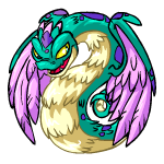
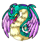
Faerie Hissi
Posted: 19 Sep 2009 11:47 am
by Nameshifter


Credit to neocolours.de
I wish they would have kept the feathery look the old one had for the body and the crest on it's head, but I do like the colors. Though the spots on the head look odd to me.
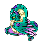
For those who haven't seen it, this is the old unreleased Faerie Hissi:
Re: Faerie Hissi
Posted: 19 Sep 2009 12:25 pm
by Sorah
I don't like the "New" Faerie Hissi =(
Re: Faerie Hissi
Posted: 19 Sep 2009 12:26 pm
by Mistress Morbid
Hmm...well, it's rather pretty actually. I'm really loving that colour scheme, I only wished they had added a few more details (perhaps on the chest and head). Honestly it's not bad though, I'd even consider getting one if I had more free pet slots.

Re: Faerie Hissi
Posted: 19 Sep 2009 12:56 pm
by Pyrostatic
While Hissis don't do anything for me, the colour scheme on this Faerie one is quite lovely. Although, I think it looks too dark. At least they have feathery wings.
But the unreleased one was the best.
Re: Faerie Hissi
Posted: 19 Sep 2009 01:35 pm
by Madge
I love the colour on that hissi! it's absolutely gorgeous!
If only the "hands" didn't look so awful on the new hissis

Re: Faerie Hissi
Posted: 19 Sep 2009 02:25 pm
by Seerow
That is actually really really lovely. I think it might have been perfect if the wings had replaced the hands entirely and maybe had a cream belly, but this is rather lovely. I wouldn't mind owning one that's for sure.
Re: Faerie Hissi
Posted: 19 Sep 2009 02:51 pm
by MeZergy
At least they didn't just slap faerie wings onto a blue/red/green/yellow base... still, I'm not a big fan of it. The colors are so low-temp that my eyes just glaze over it. It should at least have a different colored belly to at least match the eyes. While it's not hideous or ugly, it is rather boring.
EDIT: See how much difference one color change can make?
 hehehe... don't scold me... I don't think I'm superior... I just do these for fun.
Re: Faerie Hissi
Posted: 19 Sep 2009 05:25 pm
by TCStarwind
It has a fairly nice color scheme, but I don't like those eyes. They could have made them green or something. And ditto what Seerow said about the wings.
Re: Faerie Hissi
Posted: 19 Sep 2009 06:45 pm
by Katieo1992
I hate it. The revamp of the site is why I quit. Most of the revamps are ugly, and this is not excuse. They completely ruined the Faerie hissi. Neopets has died for us veterans.
The faerie hissi is just like the others; its simply recolored now to have a single color scheme: purple, blue and green. They all look the same and there is nothing special or unique about them. The old hissi had a unique pose and style to it, so it was unlike all the other pets.
my rating: -20000/10 >:P
Re: Faerie Hissi
Posted: 19 Sep 2009 07:26 pm
by champagnesoup
Katieo1992 I've been playing on and off since Neopets started and it hasn't died for me so I think that's a bit of an overstatement

It's OK, the colours scheme is a bit 80s for me but it could be a lot worse. MeZergy, the one you did with a yellow belly looks way better! I wouldn't go out of my way to get one but I would be happy if the lab ray gave me one.
Re: Faerie Hissi
Posted: 19 Sep 2009 08:13 pm
by Jazzy
Agreed - speak for yourself! Personally, I always though the old Hissi was anatomically impossible (the wings can't open beyond the position they're in, since you can see the individual feathers and feathers can't widen) and would never have been worth even the old price of a faerie pb. I wish the hands and wings had been combined here since having both does look a bit awkward, but I still think it's the far better version of the two. And it's a bit silly to say that customisation ruined this one when the old version was clearly never going to be released as is; it'd been on the server for almost a year and a half prior to customisation.
edit: here's some of the old poses.
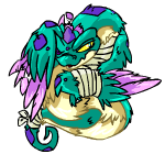
The Beaten in particular looks a lot more like early Neopets art than what they were producing in 2005.
Re: Faerie Hissi
Posted: 19 Sep 2009 08:40 pm
by daisybell
Well, I don't like the new one very much- I love the colours, but I've never liked Hissi and never wanted to own a winged snake pet. The hand-wings are unnecessary, except that in terms of putting clothes on it, they are- I assume that's why they were left on. I think the belly colour is just right as it is- faerie pets don't have to scream with loud contrasting colours. I do think something on its head (antennae, maybe?) would have improved it.
In comparison to the old one, I prefer the new. The unreleased version had quite a few flaws, as Jazzy pointed out, and the feathered stomach really doesn't work, in my opinion. At least the new one is less anatomically improbable- except for the two pairs of wings.
I think we have to be very careful when we compare new pets to unreleased ones: it's not as if the unreleased version was ever promised to us or given to us as players, if we went out and found it (rather than being shown it) then it's our problem if we are disappointed when it fails to materialise. There was some reason why it was decided not to release the pet, perhaps it was mistakenly uploaded before being approved, or maybe approval was withdrawn.
Re: Faerie Hissi
Posted: 19 Sep 2009 08:56 pm
by Rainbow Daydreamer
Goodness, it's beautiful. I don't really go for Hissies, but I can't help thinking I would love to own one of these. The colours are amazing, and for some reason I love the turquoise on the inside wing.
Re: Faerie Hissi
Posted: 19 Sep 2009 11:28 pm
by varii
I like it for what it is. I is not a pet I would get as I don't really like faeries or hissis, but within the constraints of the faerie colour it turned out very nice. I know that they changed the concept of the hands/wings with 2.0 but seeing wings on top of what I still consider wings looks silly.
I like the colour scheme and the belly as is. Changing the belly just makes the wings look even more pasted on, in my opinion.
And as for the old design, the idea behind it was nice but really poorly executed. Had it been released we would have all torn it to shreds based on anatomy. I can't imagine the other poses not looking really ridiculous.
Re: Faerie Hissi
Posted: 20 Sep 2009 12:26 am
by Skitty
Cripes.
I haven't played Neo in ages but I still check up on color release threads here for occasional laughs, lol whats, and nostalgia.
This thing drove me out of the woodwork to actually comment on how awful it is. It's practically the poster child for lazy, awful faeries of the post-devamp era.
This evokes images of the old widely-hated, often criticized, green-faerie-four-winged (six winged?) Korbat. FOUR WINGS! What's the matter, here? How can this be excused?
The colors aren't awful, but the half-assed yet mostly decent recoloring job only serves to highlight the absurdity of the pet itself. Where's its antennae? Fur/feather tufts? Swirls and elegantly lengthened body parts? Couldn't we have a token feather clump in memorial of the old Faerie Hissi? It's literally a normal hissi with wings pasted on yey. I know it's unreasonable to ask TNT's resident recolor monkeys to make an effort--but come on here. Old one was awesome in concept but crap in execution, this one is crap in both. Hell, there is no concept anymore.
Also, the wing anatomy is not one single iota better then the old one. Old one's wings were a joke. This one has two pairs of wings, both of which appear to be attached to the same 'shoulder,' of completely different types and neither are anywhere close to believable. The feathered wings pinned to the back of its neck are on par with the old forward-facing Faerie Kougra's level of anatomical accuracy.
The Hissi already had wings. Sure, they're mostly used for cooking invisible fried eggs now... but they could've done SOMETHING with it. Bad, bad, bad, lame pet.
 Anyone remember these?