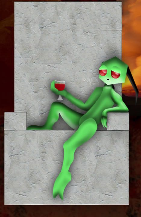
As a note, this is not the full image or at full size. THe whole image is 36 by 23 inches, since he was meant to be a poster but got a tad too big for the paper. I also out most of the background to make this smaller.
Overall, I think I've done well on this. However, I'm stuck on a few things. First is the the caved-in/nonexistent chest. I've noticed this, but haven't got a clue what it should look like, besides the fact that something should go there.
Two, I can't get past the way the bottom of the chair seems to sort of be floating over the rock ground. The red rocks are a filter in Photoshop, but trying to extract from the background and place rocks over the base of the chair didn't work right; it just looked like there was I erased part of the base by accident.
^_^; Sorry if this mesage didn't come out right in my quest for help. In rereading it I feel like I sounded like I wasn't really looking for critique, just a fix for the problems I've found. Not really what I was going, for, just that those problems are, in my opinion, glaring.