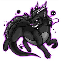
I think he's rather adorable. I really like the sort of "Muwhahaha" look he has going on. And, like most Paralix, the super soft fur and pretty mane. I do have one crit though; he doesn't seem to have any weight to him. It looks like he's just floating in mid-air in a sitting position or something. I don't really know what could be done to fix it or if there is even anything wrong really as it could just be me.
I don't think there's anything wrong with the way he's sitting; I really like it actually. The only thing that bothers me is that the colors aren't very varried. He's very monotonous, and I wish the lighter horns and ears had been kept. Other than that, I like him.
TCStarwind, I didn't really notice til you said it, but you're right. He's pretty montone, colorwise, and I think a bit of variation would have been nice. Of course, a lot of the Paralix colorfills (sadly) do not have a lot of variety, either, so eh.
Other than that, I like the pose a lot, but I think the face just looks goofy to me, rather than a 'come hither' or 'mwahaha' look as Seerow put it xD I think he almost looks kind of constipated ;_;
I quite like this except for the head position; it looks uncomfortably thrust forward. It brings to mind what a turtle would look like if it was trying to crawl out of its shell.
I'm so happy to see this updated. The mane is pretty, the fur is so soft looking and I like the pose. I agree about the colours being montone but I can live with that. I'm not a fan of the expression on it's face. It looks like it's pouting. I would of wanted more of a "muhaha" expression to it. As it is, it doesn't fit my Amar. Such a pity. Well I have bloodred to wait on before I make a colour decision on Amar. But other then that it's a great update.
I'm not as impressed with this as with some of the other recent Paralix. I wish it were in a more graceful pose.
I find the expression sort of cute and puzzled and I was trying to figure out what it reminded of. Then I realized it reminds me of my parent's tabby cat -- he has such a serious little face. But, that might not have been what the artist was going for!
If I get him at the right angle, he has a rather moody "Back off" or "Don't come any closer than you have to" look to him, both of which are fitting for the color. Otherwise, he can look like a confused old man.
Also, he. Very masculine and I can't picture it as a female character at all.
But, still, really pretty. I think the horns and belly could have been a bit lighter, but I especially love the stickyness of the dark matter. It has nice drippy lines connecting things. :3
Keshi, the giant version looks so much better and lighter colored, too. It's too bad we don't get to see that one on the site. :< All those awesome little details get lost.