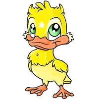
I'm not a big Mallarchy fan, but this is without a doubt my favorite of the revamped lot so far. Someone in the news comments mentioned that the beak looks awkward, and I'd agree except I think it's due to the angle of the face. They eyes are beautiful, and I love the little raised wings; like it's trying to wave. Or fly.
Urk. I have to say I don't like it very much. The body is all right, but the head looks extremely... square. And the eyes are really freaking me out for some reason. I don't remember what the old one looked like, but I don't really care, as I had no intention of owning one.
I... I don't like it. Even for a Chibi pet, it seems out of proportion, due to the size of its head. Plus, with the way it's tilted, it looks like it can't quite hold it up straight.
Everything below the neck is great, but I can't deal with the face at all. The eyes themselves are beautiful, but the way they're set in the head, just, God, no. Also, this is not a great angle to view the beak at. It is very well-executed, insofar as it is clearly a beak and not a pair of huge, fleshy lips, but it still freaks me out.
I can post the old one when I get home in a few hours, I have it saved. I don't remember what it looked like at all, so I can't really compare the two.
The new one is pretty adorable though, even if it's nothing I'd ever own. I like how huge it looks. I imagine that if you met one in real life it would be the size of Godzilla, which is just neat
Hmm. I like the old baby Mallarchy quite a lot more than the new one. The new one is certainly colored better (and I prefer the palette), and better detailed, but I prefer even the proportions and attitude of the body. So: fail.
I agree with Mr Black on every count. The old one was cuter (if crappier, technically) and I am terrified of the soul-eating properties of the new one. Yiiiii. *flees*