Also, try to keep in mind where your lightsource is, and don't be afraid to shade in large areas leaving no base showing if they are far away/obstructed from the lightsource.
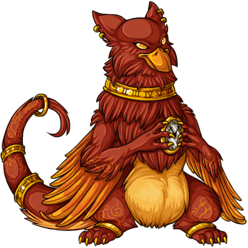
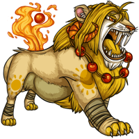
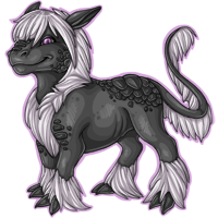
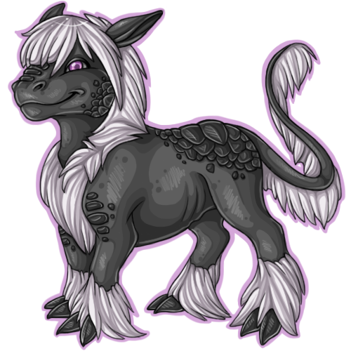
Also, highlights work really well when they're gentler - try to avoid using white or a lighter colour than what you're putting the highlight on. For example, highlight orange with yellow, or a dark purple with maybe a cyan colour - experiment! I notice especially on the green dragon that the highlights seem to be all placed along the lineart - I would generally avoid this, as it gives a kind of plasticy effect - with something like a dragon, you can highlight little scales all the way down one side of it's body. With a furry animal you can draw in strands of hair as highlights. Another place to experiment with different techniques
Try practicing with different shades and highlights on one image - slide the hue adjuster across until you start getting effects that you like. I still do it all the time, and I'm still learning all the time! Good luck though, you're definitely improving all the time!


