The 164 has always freaked me out and making it looks even more blubbery doesn't really help matters. Though apart from an entire redesign nothing would have changed my opinion of this guy. The details on the tongue and teeth are very well done though, great job there!
The 625 is amazing and I want one. The details on the fur is really stunning and I can't stop staring at that gorgeous mane. I think this most definitely should please fans of the old design while bringing it up to Subeta's current standards. What a gorgeous pet. Anyone know the artist?
the 164 looks grosser than it ever did before, and the texture is AMAZING on it - and the teeth, thfkdahk . I hate teeth ;_; These teeth look great, for teeth.
I agree, the fur on the 625 is beautiful! It looks really fabulous and the hair looks so shiny.
The teeth were the only part of the 164 that I liked. It was funny because they were perfectly rectangular. The "real" teeth look better with the pet itself, I guess, but now I hate all of it instead of hating only 95% of it. ;) Such a gross experiment.
I definitely like the fur and details on the 625 better. I'm not positive about the skull cap, though. It seems like the eye on our left is sagging. Maybe it's the perspective. (Then again, it's an experiment. Maybe it's sagging.)
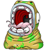
 Experiment #164
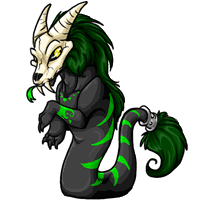
 Experiment #625