New Features/Updates
Re: New Features/Updates
I'm simultaneously SUPER EXCITED and a little bummed that the new clearing system debuts on the 23rd! A little bummed because an hour ago I had the impression that the system was getting implemented today rather than in 2 weeks, boo. The name I've been watching for 2+ years becomes eligible within a matter of days. ;_; God forbid the person is told by a friend or logs in on a whim. Heads would roll...
Re: New Features/Updates
According to the announcement thread, anyone whose account is about to clear will be notified 24 hours before the actual clearing, so they very well could log in at the last minute. I understand why they'd get notified of course, but it's very frustrating. Luckily the two pet names I'm after are both on frozen accounts this time, but still...
Disregard that, I read wrong. It's the messages on Subeta itself on profile pages saying when an account will be deleted, like usual, not an actual notification to the user. That's a relief.
Disregard that, I read wrong. It's the messages on Subeta itself on profile pages saying when an account will be deleted, like usual, not an actual notification to the user. That's a relief.

Re: New Features/Updates
Oh that's good, Slugawoo. I believe I read something wrong also and was under the impression that idle users would be receiving email notifications. A tiny bit of relief.
-
Seerow
- Posts: 2793
- Joined: 19 Jan 2006 08:47 pm
- Gender: Female
- Human Avatar: 155383
- Location: Mystery Island
- Contact:
Re: New Features/Updates
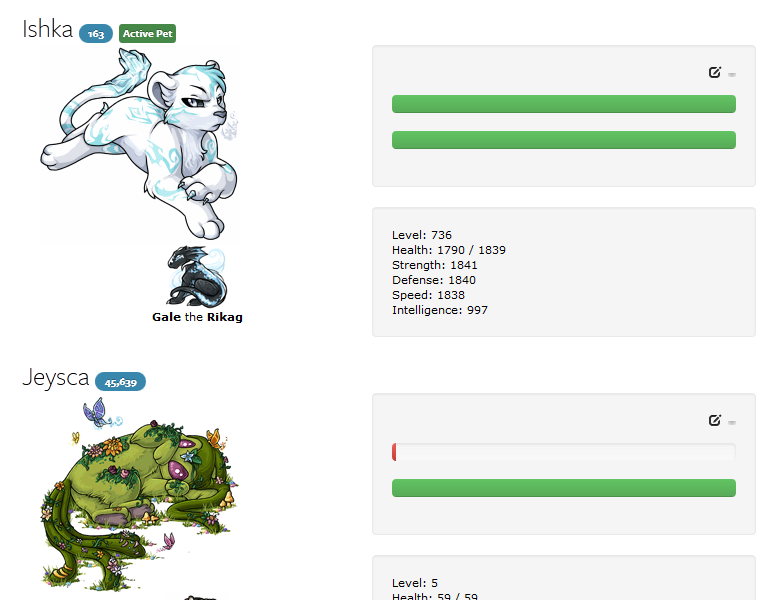
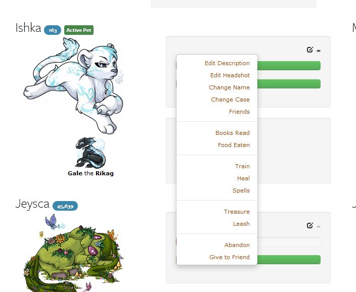
Ugh more ugly as hell page changes. Why is there giant unlabeled bars across the page? Would it have been that much of an effort to label them? I had no idea you can hover on them until it was brought up in the thread, it's not initiative in the least. I don't like any of the new fonts, they all look horrid, especially the pet rank which is so very squashed in the stupid blue bubble. With not outlines between the pets they all all just run together. But finally my biggest pet peeve is that you can't get to your pet's profile through the page itself. Why? Also, I hate drop downs.
Since it seems not everyone has this change yet (it is rolling out in phases apparently) here are some screenshots. And consider yourself lucky you can have the old one for awhile longer.
 ]
]
Since it seems not everyone has this change yet (it is rolling out in phases apparently) here are some screenshots. And consider yourself lucky you can have the old one for awhile longer.
]Wanna donate towards my drink gallery, the Golden Goblet.
Re: New Features/Updates
The change is also shrinking the pet images or something, at least on my screen, which is making them slightly blurry. I'm super impressed they chose to sacrifice art quality so that I can have a giant bar showing pet happiness, which counts for absolutely nothing. Hunger is slightly less useless, but only just. I have 25 pets, and only two of them ever battle, so I keep them in the resort. I know they're not hungry, I don't need a hideous green bar to tell me that.
I braved the forums to see what the general reaction to this change was, and as always, I immediately regretted it. Once you wade through all the ass-kissing, you'll find Keith saying things like "You have all of the options per pet in the dropdowns (which are very easy to get used to)". I hated drop-downs long before I started playing Subeta, and I still hate them now. It's not a matter of getting used to them. It's a clunky, ugly feature that I find off-putting, no matter the site. Plus, he makes it sound as if all the old information is still there, which isn't true. The two things on the pet page I used the most (view pet profile and pet treasures) have been changed in a way that now, it takes me more clicks to get the info I want.
I guess the point was to streamline the look of the site (which it doesn't), whether or not it actually streamlines the function (which it doesn't).
It does not do to dwell on dreams and forget to live.
Re: New Features/Updates
I think the change is okay, but I don't look at my pet overview page very often. The hunger being represented as a bar is a bit more convenient than the vague texts they had before, for those who are working on the gourmet achievement. The bothersome thing is that the change broke all the overlays I had there. Going to have to spend some time with my custom CSS...
edit: Yay fixed. For those who want overlays on that page, the custom css:
Replace tigrean_reborn.png and the petid= with your pet's corresponding urls, and the last url with your overlay.
edit: Yay fixed. For those who want overlays on that page, the custom css:
Code: Select all
.span5 img {}
.span5 img[src="http://images.subeta.net/pets/tigrean_reborn.png"], .span5 a[href="pet.php?petid=881940"] img {
padding-top: 200px;
width: 200px; height: 0px;
background-clip: padding;
background-image: url("http://img.photobucket.com/albums/v16/backlash/Subeta/isisol.png");
overflow: hidden;}

For minions:

.span5 img {}
.span5 img[src="http://images.subeta.net/items//minion_nun.gif"], .span5 a[href="pet.php?act=minion&petid=881940"] img {
padding-top: 64px;
width: 64px; height: 0px;
background-clip: padding;
background-image: url("http://img.photobucket.com/albums/v16/backlash/Subeta/nuun.png");
overflow: hidden;}
-
Usul_Princess
- Posts: 1191
- Joined: 03 Mar 2006 12:19 am
- Gender: Female
- Location: Mars
Re: New Features/Updates
I haven't read through the pages, but I can't change my avatar. It says the version of Firefox was outdated (which it was). I've updated it to v 13.0, and it's still telling me I need to update.


-
AngharadTy
- Zombie Queen
- Posts: 5251
- Joined: 08 Jan 2006 05:20 am
- Gender: Female
- Human Avatar: 89833
- Location: Tyland
- Contact:
Re: New Features/Updates
This is the most awful change subeta has ever put forth, and they've put forth a lot of awful lately, so you know, that's considerable. I can only hope that ALL this ugly shit is customizable. Maybe some people want giant bars, but I really, really do not. And dropdowns. Godforsaken dropdowns. Always with those things. I can't tell you how much having to click more has ever improved my experience on a site.
Topher, your pets are smaller because (as before) they shrink when your browser gets smaller. They're full size at, oh, a window 1400 px wide or so. I really can't express how much I hate having my browser fullscreen all the time. The only reason it's even as wide as it is right now is for subeta and its idiotic shrinking pet images. Yeah, I love having this much white space on my big-ass monitor.
And of course my pets need overlays--I haven't tried your code yet, Griffin, but I'm sure it's good, except that they probably don't shrink when the window shrinks. And my minions need overlays, and I have to turn off those ugly bars, and I still have to change that really unattractive font that subeta is suddenly so fond of.
Do they have no one on staff who actually designs websites? I mean, designs websites other than this one. Or has ever, like, taken an art class or something. Even basics like "attractive proportions" are never maintained here.
Usul, the wardrobe has that warning about Firefox no matter what version you have, and no matter what BROWSER you have (it tells me about it in Chrome). Yet another piece of bad coding on the site. But do try the wardrobe in another browser, e.g., Chrome.
edit: I just tried the two top-rated noscript copycat plugins for Chrome and neither one has a setting that will allow everything except for what I specifically call out. They both claimed they did, but I was having to whitelist every single site I went to with both of them. I do not want to be stuck with typekit's terrible fonts, ughhhh.

-
Silverevilchao
- Posts: 1586
- Joined: 07 Jan 2006 09:04 pm
- Gender: Female
- Human Avatar: 155477
- Location: Home. :)
- Contact:
Re: New Features/Updates
Why do we have bars for the hunger/happiness? If anything, I'd thought we would've had bars for each stat - like those found in the monster profiles for Shin Megami Tensei games (or my really old Pokemon spoofs of Persona 3 profiles). And why are the bars so big? There is no reason for each bar to be so large. I mean, I don't mind the stuff on the side in their own box. It's a clean look. But I don't see the point of massive bars for hunger and happiness, especially since they really aren't such huge parts of the site.
Dropdown menus make sense with the gazillion amount of possible items. I thought that it was annoying to go to a different page to the view the options for each pet. That said, I'd much prefer a division of the page that was hidden by Javascript unless something is clicked on to make it show up beneath the pet stuff (like what I have for my song search form on one of my sites), rather than a "dropdown" that shows up over everything.
Dropdown menus make sense with the gazillion amount of possible items. I thought that it was annoying to go to a different page to the view the options for each pet. That said, I'd much prefer a division of the page that was hidden by Javascript unless something is clicked on to make it show up beneath the pet stuff (like what I have for my song search form on one of my sites), rather than a "dropdown" that shows up over everything.
-
Officer 1BDI
- Posts: 1641
- Joined: 16 Jan 2007 10:14 pm
- Gender: Female
- Human Avatar: 150891
Re: New Features/Updates
Bless you for that code, Griffin.
I'm pretty sure anything I would say re: the new pet page has already been posted. >_>
I'm pretty sure anything I would say re: the new pet page has already been posted. >_>

Re: New Features/Updates
Here's something else I posted on the forums in case you guys don't look there. This will make the bars skinny:
You can also add width: 150px to make the length shorter. Display:none can zap the bars altogether but it looks weird.
Code: Select all
.bar,.progress {height: 5px;}-
Foghawk
- Posts: 369
- Joined: 03 Jun 2007 08:58 pm
- Human Avatar: 254768
- Location: a narrow dusty room
- Contact:
Re: New Features/Updates
Sheesh.
Okay, I approve of doing away with the options page, though a) why on the pets page instead of the inventory page, where it is genuinely and sorely needed, and b) oh my god, screw dropdowns, but if you are going to make a dropdown, make an actual dropdown, there are native elements for that. But, uh, other than that, this does not look like improvement.
Here's my Pets page; it looks like this.
EDIT: They broke it but I fixed it again. Use this code instead; it comes out pretty much the same as before.
EDIT2: They've added a "View Profile" link that made this go wonky; I've cleared it up.
EDIT3: More updates, more fixes. Once more unto the breach, dear friends...
EDIT4: One of the weirder architectural errors has been fixed, breaking some code. Also, borders work properly for both even and odd numbers of pets now.
*EDIT: For my own amusement. It's this. All of it. The wells. The ugly menubars. The shitty dropdowns. The off-palette buttons. The Helvetica Neue. Even the awful anti-semantic class names. They didn't even bother to change the color schemes!
...Excuse me. I'll be laughing my ass off.
I guess things could be worse. At least we're not back to Java applets and Papyrus.
Okay, I approve of doing away with the options page, though a) why on the pets page instead of the inventory page, where it is genuinely and sorely needed, and b) oh my god, screw dropdowns, but if you are going to make a dropdown, make an actual dropdown, there are native elements for that. But, uh, other than that, this does not look like improvement.
Here's my Pets page; it looks like this.
- Spoiler: open/close
EDIT: They broke it but I fixed it again. Use this code instead; it comes out pretty much the same as before.
EDIT2: They've added a "View Profile" link that made this go wonky; I've cleared it up.
EDIT3: More updates, more fixes. Once more unto the breach, dear friends...
EDIT4: One of the weirder architectural errors has been fixed, breaking some code. Also, borders work properly for both even and odd numbers of pets now.
- Spoiler: open/close
Yeah, I wondered this too. Things have been getting very... gadgetty lately. (The kind of sloppy, ugly code going on here is usually a sign of using other people's website tools to generate things automatically, without tailoring them properly to your own use.*) That, and the increasingly kaleidoscopic color/shading schemes, and border designs, and UI elements, and font choices... Honestly it was the text figures popping up again that really ticked me off. They're wrong from a technical standpoint and wrong from a design standpoint. But somebody thought they looked slick, so here they are.AngaradTy wrote:Do they have no one on staff who actually designs websites? I mean, designs websites other than this one. Or has ever, like, taken an art class or something. Even basics like "attractive proportions" are never maintained here.
*EDIT: For my own amusement. It's this. All of it. The wells. The ugly menubars. The shitty dropdowns. The off-palette buttons. The Helvetica Neue. Even the awful anti-semantic class names. They didn't even bother to change the color schemes!
...Excuse me. I'll be laughing my ass off.
I guess things could be worse. At least we're not back to Java applets and Papyrus.
Last edited by Foghawk on 18 Nov 2012 10:51 pm, edited 6 times in total.

-
Seerow
- Posts: 2793
- Joined: 19 Jan 2006 08:47 pm
- Gender: Female
- Human Avatar: 155383
- Location: Mystery Island
- Contact:
Re: New Features/Updates
Foghawk, that looks amazing. Seriously, it does. Thank you for all that coding.
Wanna donate towards my drink gallery, the Golden Goblet.
-
Silverevilchao
- Posts: 1586
- Joined: 07 Jan 2006 09:04 pm
- Gender: Female
- Human Avatar: 155477
- Location: Home. :)
- Contact:
Re: New Features/Updates
Hey guys, did this happen a while back and I just didn't notice (don't really have any free time...) or did this change just happen? Shop searches look SO much different now....I don't like it. The tables looked fine before. Now the table just looks plain squished, especially on my new computer, with its massive screen.
-
Seerow
- Posts: 2793
- Joined: 19 Jan 2006 08:47 pm
- Gender: Female
- Human Avatar: 155383
- Location: Mystery Island
- Contact:
Re: New Features/Updates
The shop search happened towards the end of April, around the same time a lot of other stuff changed like the shops, the training, etc. And that is also when they added the ugly Typekit fonts to every inch of the site. Believe it or it was even uglier before he tweaked it again!
Wanna donate towards my drink gallery, the Golden Goblet.
Who is online
Users browsing this forum: No registered users and 3 guests