Hello everyone, it's been so long since I last created a topic here. ^_^
Anyways, I thought that I'd just like to share with you two of my most recent pieces of art that I'm rather proud of.
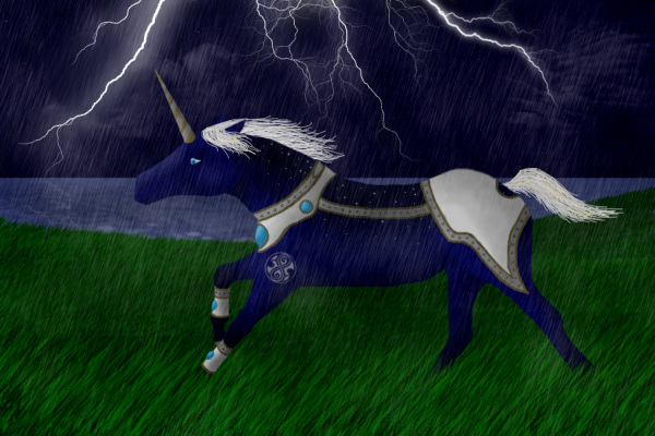
Here is my first piece which is of my stallion Raxacoricofallapatori:
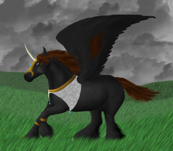
Here is one that I did for a friend of mine on Deviantart:
What do you think of them?
I'm quite proud of them although there are definitely faults in both.
Also, would you mind voting for my uni in the BC this week?
All my friends said I should have a shot at entering it and so I have, any and all votes are appreciated, just click on the picture below. ^_^
<a href="http://www.neopets.com/beauty/details.p ... tori"><img src="http://i16.photobucket.com/albums/b1/Ho ... G.jpg"></a>
(I had to add wings to that version because if I didn't the BC judges wouldn't allow me to enter it. I really hate the wings on him, I did a crappy job. ^_^)
Uni Art
-
- Posts: 75
- Joined: 21 Jun 2006 03:08 am
- Location: Behind You
- Contact:
How pretty! I really like the sky on both pieces, very stormy and excellent clouds. The tattoo and armor on the first piece is excellent as well. Did you draw that lightning yourself? It's very good.
The only things I'd point out as flawed are just little things that will probably fix themselves over time as you improve. The one thing I noticed is that it looks like you used the Photoshop grass brush in at least the first one, or something similar. While you did take care to make it look more realistic, that brush usually ends up looking somewhat tacky. I'd steer clear of it, or use in limited amounts. Apart from that, I just would clump the mane and define the face a little bit more, even if it's dark. I see you already started fixing those things in the second drawing.
Neat rain effect, by the by!
-
- Posts: 14
- Joined: 11 Jun 2006 11:20 am
- Location: At my desk drawing
Yay! A Doctor Who fan. ^_^Huggles wrote:Raxacoricophalapatori...us?
Heeeeeee. Doesn't look at all Slitheen. I was going to vote anyway, but you left me with no choice.
I just really liked that word, and so it stuck.
I just love saying it and getting my friends to try say it, they always muddle it up, I can say it with such ease.
I couldn't call him Raxacoricofallapatorius because it was too long, but that is his actual name, it was just shortened to Raxacoricofalapatori on neo though. XD
I'll be having a new character soon named after another Doctor Who thing...Judoon.
Thanks for the vote Huggles! ^_^
I'm trying to steer clear of photoshop grass, but untill I can draw uni's better I'll be using it. Once my uni's get better I shall start working on my backgrounds.
I didn't do the lightning though, I went on google and looked at lightning pictures and turned them into CS2 brushes, I'm such a cheat.
Who is online
Users browsing this forum: No registered users and 0 guests