Here are the applications for news poster. There are nine- please choose a <b>maximum of four</b> of them and send their numbers to votecollection as outlined on the main election thread.
The only editing I have done of these is removing any comments to me at the top or bottom.
News poster election
-
dandelions
- Lily Was Here
- Posts: 823
- Joined: 26 Apr 2006 09:56 pm
- Contact:
News poster election
Last edited by dandelions on 13 May 2007 07:21 pm, edited 1 time in total.
-
votecollection
- The Psephograph
- Posts: 9
- Joined: 06 May 2007 02:56 pm
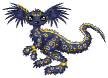
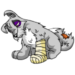
1 wrote:Grey Lupe:
I want to like Lupes, I really do. I just cannot seem to find the lupe love, and this colour is not helping much at all.
First thing that pops out to me is the sade pose, and how it just looks like a gigantic lump (and not the good kind). The eyes, in most poses in which they're open, remind me not so much of a depressed dog so much as a dog who is just getting over a bug, and needs a cup of coffee.
<img src='http://images.neopets.com/pets/beaten/l ... y_baby.gif'>
the Beaten pose annoys me; the cast looks paste'd on, and the head, and the way it's leaning makes the whole pet appear to be falling over. In the angry pose, the fur right under it's neck is doing some weird sticking out type thing which I don't quite get, and I don't like at all. I'm not too impressed with the shading either, it looks very flat to me, with parts (such as the left front paw on the sad pose) which just looks wonky. All in all, I'd call the Grey Lupe a disappointment
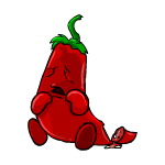
Pepper Chia:
I must say, I want to adore the Pepper Chia. It is a cute, silly pet that tries really hard, even though it doesn't quite reach the bar. Despite this, it is one of the prime reasons I love fruit/veggie Chias. Bright spots of this pet have to be the “extras” in the poses, such as the steam in angry, and the fire in the Ranged and Close attacks. The seeds in the hit pose also make me giggle much more than they probably should.
The biggest problem, though, with the Pepper Chia, is the way the body changes shape. It gains and loses weight between each pose. This is most noticeable when you take the Happy pose, and put it next to some of the somewhat pudgy poses, such as the Close Range and Defended, or the gigantic Hit and Beaten poses.
<img src='http://images.neopets.com/pets/defended ... .gif'><img src='http://images.neopets.com/pets/happy/ch ... .gif'><img src='http://images.neopets.com/pets/beaten/c ... r_baby.gif'>
The stomach of the beaten pose also sticks out to me because it is much larger than it seems it should be. The Pepper's “Tail” section past its feet changes length between poses, which is also slightly annoying. I do, however, love what they did with the tail in the beaten pose, it is easily the bright spot of that pose.
The Pepper Chia is an idea that is fantastic in concept, and it has some definite bright spots, such as the fire and the steam, but the execution is just too flawed in certain places for me to look past it and be able to rate it highly.
White Poogle:
I really like the White Poogle. As a colorfill, there is not much I can critique in the anatomy without dealing with Poogles in general, but I find it fairly well drawn. What I love, though, is the colors chosen for it. The light blue works really well, and it's a definite white color, which you don't always get. With White pets, their success, I find, is based on the color they use to accent the white, and the color of white that they use. For Example:
<img src='http://images.neopets.com/pets/happy/ju ... e_baby.gif'>
The problem with the White Jubjub, IMHO, is that it's not white. It's Cream. It's a good color, but it doesn't fit for white, IMHO. Other pets with this problem include the Mynci and Grarrl.
<img src='http://images.neopets.com/pets/happy/uni_white_baby.gif'>
The Uni's problem, in my eye, is that it misses the mark with the accent colors. The hoof and hair color is atrocious (and why are the hoofs and hair of a horse even then same color?) and you also have the yellow horn and the dark blue eyes in there that make it a gigantic mess. Flotsams and Usuls also have this problem in spades.
The Poogle, though, has decent accent colors that actually accent the pet, not overpower it, and it has a nice base color. There isn't much more you can ask for in a recolour.
I'm a vote-collecting account- please only talk to me if you're voting for something.
-
votecollection
- The Psephograph
- Posts: 9
- Joined: 06 May 2007 02:56 pm
2 wrote: White Poogle
This is a solid colorfill pet. There's nothing particularly special about it, but there's nothing wrong with it either that isn't true of the basic poogle in general (specifically, the hit pose, which I never really noticed before - poor thing got its neck broken). It's good to see a white that's actually white instead of some odd color like blue or cream. I like the shade of blue used for the markings; it compliments the white well without being too glaringly colored as is the case with the gnorbu. Some white pets are successful using only gray as a secondary color, but using blue here gives the poogle a bit more life.
Grey Lupe
Somewhat disappointing. The grey pets I consider worthy of the price of the brush are pretty few, and this is not one of them - though admittedly it could be worse. The main problem here (probably due to the way the eyes are always closed or mostly closed) is that it looks more sleepy or tired than depressed. The best grey pets manage an adorable timidity where you just want to pick them up and hug them till they feel better. The lupe doesn't provoke much of an emotional reponse at all. The best pose is probably beaten, where there is a sense of complete and utter defeat with no hope of life ever getting any better; that's the essence of grey.
I must say that it's delightfully scruffy, and the constantly drooping ears are a nice touch. The poses are mostly droopier versions of the normal ones but they're done fairly well and don't look copied - you'd have to look at both versions to notice.
Pepper Chia
I nearly decided to dislike this color for the petty reason that it forced me to go look at a bunch of chias so I could compare it. By comparison, pepper is pretty good. It still has the weird mouth but it's been shrunk so much to fit the thin body that it's barely noticeable, a definite plus. It's also nicely creative. The ranged and close attack have fire, the angry pose has smoke coming out of its ears, and the hit pose is cleverly losing seeds. The beaten pose is decent, with an end sliced off, but since fruit chias in general have good beaten poses it gets fewer points for that one. It's a shame the actual art isn't better - this one follows the pattern of the rest of the chias with its formless blobby feet and inexplicable shapechanging between poses. Actually, in this one the shapechanging is even less excusable; for all we know, the regular chia is really an amorphous blob. But a pepper ought to be fairly solid.
I'm a vote-collecting account- please only talk to me if you're voting for something.
-
votecollection
- The Psephograph
- Posts: 9
- Joined: 06 May 2007 02:56 pm
3 wrote:Grey Lupe: the grey lupe is a pet which can justifiably be called "nice"- it is neither outstanding among other grey pets nor hideous. It has not been fully redrawn or reposed, which does not count in its favour considering that the grey paintbrush is one of the most expensive in the game. Indeed, the ranged attack pose appears to be a direct copy of the happy pose with some changes. On the positive side, the shade of grey used works well with the lupe and avoids it looking like unfired clay. The shading is not heavy or clumsy like that of the grey peophin's and it appears to be in no danger of melting (a common complaint among several grey pets). If you look for a little bit longer at the circle or happy pose then the pet does appear to be leaning somewhat, as if it might fall over any minute, but this is rather dependent on how the individual sees it.
Overall, it is not superb and doesn't stand out among grey pets. But on the other hand, for someone who wanted to be able to paint a particular pet as a grey lupe, this is perfectly acceptable and could be a blank canvas for many interpretations of personality.
White Poogle: An initial impression of the white poogle is that it is crisp and clean- the shades of white used are more towards the grey and blue than towards cream, and this suits the pet well. It is, as you would expect, a colourfill, and therefore the basic lineart has not changed. However, there is the issue associated with many poogle colourfills- that of the pose sizes changing. Using the blue poogle as a reference, the circle pose of white is slightly larger, and the close attack and defended poses are noticeably smaller. The lineart is slightly fuzzy in places, in common with the basic poogles, which is a pity.
Overall, this is a nicely executed colourfill, but nothing out of the ordinary- this is probably as it should be. In comparison to other white pets, it is one of the most blue coloured in shading, but the accent stripes mainly contribute to this and the overall effect is more natural than a completely stark white.
Pepper Chia: Novelty pets like the fruit and vegetable chias are not for every Neopets player, but for those who do like them, the pepper chia is one of the most charming and original. It retains all the classic chia features- the hare lip, fuzz of hair on top of the head, simple blob feet, rectangular arms and crescent eyes, whilst being distinctive and different among its fellow chias. The shading is subtle and well executed (compare to the grape chia, which has harsh contrasting shading) and the theme of the pet is carried through the poses, with the fire in the attack poses, steam in the angry pose and lost seeds in the hit pose.
The shape of the pepper is somewhat inconsistent, particularly in the hit pose where it seems to have become shorter and squatter. The most glaring problem is that of the feet and the way the chia is posed in the circle and happy- it looks as if it is about to fall forward on its face. However, if you are prepared to suspend your disbelief enough to allow a pepper to be walking and fighting and experiencing happiness, sadness and anger, then this is quite a minor issue. In fact, it isn't the art that I have the biggest issue with, it's the name: why is this a pepper chia and not a chilli chia? That aside, this is a welcome addition to chias and novelty pets.
I'm a vote-collecting account- please only talk to me if you're voting for something.
-
votecollection
- The Psephograph
- Posts: 9
- Joined: 06 May 2007 02:56 pm
4 wrote:<u>Grey Lupe</u>
I might as well admit upfront: I'm not a fan of grey pets. That said, I can usually appreciate when a stonking new grey has been drawn and the lupe... is not one.
The shade of grey used is very pleasant, and would be lovely were the pet just grey-coloured. But it somehow falls short for a grey <i>mood</i>, being rather light.
As for the poses, well they just serve to emphasise all the worst parts of the lupe revamp: huge paws (except in defended where they're mysteriously small), puppyish demeanor. This is probably because the grey lupe is pretty much a straight trace of the (then ongoing) revamp with a broken necked head slapped on in happy and angry.
It's not entire unredeemable mind. The 'happy' expression is great if you ignore the rest of the body, and close attack is pretty fabulous in pose and attitude. Defended would be good if it looked like it belonged to the same pets as the rest of the poses.
All in all, I'm just convinced by this pet's greyness. Its poses are too dynamic, its shade too light and its emotion too tacked on.
<u>Pepper Chia</u>
Things which are right about this pet:
- viewed individually, a lot of the poses are pretty good. I love the puffs of steam in angry, the fire in ranged/close attacks, the seeds spilling out of the tiny cut off end in beaten.
- it's a pleasing shade of red and the green looks nice with it
- the shading is nice - it looks shiny and pretty authentic. We'll ignore the feet, which are hideously flat.
- the emotions in the face are actually pretty cute apart from the scary happy one
- it's not as horrifically phallic as it could have been. Yes, I do count this as a good thing.
Things which are wrong about this pet:
- it is quite possibly the least consistant pet on the entire site when it comes to continuity of shape, size, proportions etc. I think if they'd chosen the size of the battledome poses for the emotion poses I would like it a lot more.
- it looks like it should fall over in the happy pose. This really, really bothers me, probably more than it should.
- it's a chia. This is an inherent problem because they have creepy looking faces, their mouths are weird and their feet are just tacked on. So it's not like the artist could really help it.
- the beaten/ill pose has an incredibly strange body shape
Overall:
If you like chias, and you never look at two poses side by side, then this is a pretty good pet. Especially for battling. As long as you can get over the feeling of wanting to fall over just from looking at the happy pose.
<u>White Poogle</u>
This might be 'only' a colourfill, but I happen to think it is an exceptionally pretty colourfill.
The starkness of white works well with the simplicity of the poogle, and the blue-grey chosen for the stripes and chest is very nice - not so icey as they sometimes use for shading. Whilst I don't mind the creamier white pets, I do think that the cooler blue-shading scheme was the right move for poogles. After all, they do come from Terror Mountain.
The colour also works particularly well because it doesn't distract from the general poogle shape which is, since the revamp, one of the cutest pets out there without looking like it's trying hard for the title. It's an effortless cute, conveyed by expression and demeanour, not a co-ordinated plan to melt our hearts (or more realistically, brains) with enormous heads and oversized eyes. And the white adds to that beautifully.
I just can't fault it.
I'm a vote-collecting account- please only talk to me if you're voting for something.
-
votecollection
- The Psephograph
- Posts: 9
- Joined: 06 May 2007 02:56 pm
5 wrote:<u><strong>Grey Lupe</strong></u><u><strong>
<a href="http://petdb.petpetcentral.com/index.php?id=1353"><img src="http://images.neopets.com/pets/80by80/l ... _happy.gif" alt="Grey Lupe" width="80" height="80" border="0"></a></strong></u><u><strong>
</strong></u>Everyone loves a redraw. Its a chance for an ugly pet to become wonderful or for a gret pet to become even better. Sadly, the grey lupe wasn't up to expectations. While not as horrible as some other grey pets, like the Tonu, the Grey Lupe doesn't knock any socks off. Let me show you what I mean.
<img src="http://img261.imageshack.us/img261/7489/lupesza2.gif" alt="Grey Vs. Red" width="150" height="150">
Notice a big difference in poses? Neither do I. The Grey Lupe at least looks sad, as it is meant to, but only the face shows this. You would think a sad neopet would have a droopy tail, but that would've taken 5 extra minutes, and we ALL know TNT is too busy giving us great new colors...oh wait...
Another bad aspect of the Grey Lupe is it's lack of depth. Take a look at the shading and answer this question. For each part of the body, how many shades of grey do you see? Well, lets just look. For the feet, theres two. Well, how about the chest? Only two also. Now, take a look at the <a href="http://petdb.petpetcentral.com/index.php?id=570">Grey Chomby</a>. Go ahaid, I'll wait. Notice the number of shades on the chomby's body? Four! Two more than the lupe, which makes the chomby look more three-dimensional.
Although I sould like I'm bashing the Grey Lupe, it does have some redeeming qualities. Unfortunately, I don't remember any of them. All I can say is that at least the artist wasn't drunk when drawing this pet.
Overall, I give this pet 2.5 out of 5 paint brushes for its lack of originality and lack of depth.
<strong><u>
White Poogle</u></strong><strong><u>
<strong><u><a href="http://petdb.petpetcentral.com/index.php?id=1579"><img src="http://images.neopets.com/pets/80by80/p ... _happy.gif" alt="White Poogle" width="80" height="80" border="0"></a></u></strong></u></strong><strong><u>
</u></strong>Almost impossible to screw up, white is an easy color for artists to draw. Still, artists DO screw it up. Fortunately, the White Poogle wasn't unlucky. In fact, of the white pets that are avaliable, the White Poogle isone of the best.<br>
Since this pet isn't a redraw, it isn't hard to review. The only problem white pets ever have is their true color. A handful of white pets aren't even white at all. Examples are the White <a href="http://petdb.petpetcentral.com/index.ph ... ">Mynci</a> and <a href="http://petdb.petpetcentral.com/index.ph ... 2">Usul</a>. The poogle though is pure white. Honestly, this pet is so white, it could easily be lost in the snow.
Overall, I give this pet 4 out of 5 paint brushes for its flawlessness. (For future reference, only really good redraws can get above a 4 out of 5.)
<u>Pepper Chia</u></span><u>
<a href="http://petdb.petpetcentral.com/index.php?id=1850"><img src="http://images.neopets.com/pets/80by80/c ... _happy.gif" alt="Pepper Chia" width="80" height="80"></a>
</u>As every Neopian knows, this is a "Chia Only" color. This means that if you don't have a chia, you can't gett pepper. This is a nice redraw for a food color, but there is one nagging flaw.
While the pepper chia has depth, it lacks physics. What do I mean? Well, just look at the body. It's lopsided. Do you really think it could be able to stand on it's own? If you can accept the defied physics, this pet is great.
One thing I really love is the poses. They are clever, especially the one that blows fire.
Overall this pet gets 4 out of 5 paint brushes. It could have been 5 out of 5 but the physics bugs the heck out of me.
I'm a vote-collecting account- please only talk to me if you're voting for something.
-
votecollection
- The Psephograph
- Posts: 9
- Joined: 06 May 2007 02:56 pm
6 wrote:Pepper Chia
TNT clearly aren't giving up on all their original, un-revamped pets as they've recently released the Pepper Chia, the latest in their bizarre range of food-themed colours for the species.
There are some genuine fun touches on this pet - the fire in ranged and close attack, flying seeds in 'hit', and steam from the ears in 'Angry'. Beyond this, however, the pet looks quite simply-drawn - the feet and arms stuck on and rather out of place, it looks like it should overbalance forwards in its Happy/Circle poses. The Chia is, by definition, a simple pet - and this is a simple colour. If you've ever itched to get a Pepper Chia then you're in luck.
White Poogle
A standard colour-fill for the Poogle, with no variations from the basic post-revamp pet (which still freaks me out to this day). While the Poogle's body is predictably Pure Brilliant White, a rather tasteful 'White with a hint of Blue' has been chosen for the stripes. Shading is present and correct, what more can we say?
Grey Lupe
The Lupe is the latest species to be tainted by the Grey brush and, while not a total write-off, this is not a classic. The overall effect is of a very old, tired Lupe rather than the depressed, negative Lupe I assume they were aiming for.
Take a quick glance at the Happy or Circle poses and your gaze may be drawn to its enormous paws - especially the front two. The standard Lupe's paws are rather large but these are bordering on daft. A couple of poses (especially noticeable on Angry) have heavier line widths and different shading from the other poses, almost like they were drawn by different artists (compare Angry and Happy, for instance - the Lupe is standing in roughly the same position but the shading is totally different!). All the poses are inconsistant to some degree - 'Sad' has the thick lines again (and odd tears), 'Beaten' is smaller than everything else for no apparent reason, 'Hit' is massive.
I'd class this as a mid-range Grey, not horrible but certainly not as competent as the Ixi or Cybunny. Just average - how depressing.
I'm a vote-collecting account- please only talk to me if you're voting for something.
-
votecollection
- The Psephograph
- Posts: 9
- Joined: 06 May 2007 02:56 pm
7 wrote: Pepper Chia.
Is anyone else leaning in sympathy for this poor thing? It seems to be stuck in a terminal state of being overbalanced, like it's going to fall flat on its face at any second. I'm not exactly sure how those feet are staying in either. then again, I really shouldn't be analysing the biological correctness of a walking Pepper, let alone a Chia with is a bit of an anomaly as is. Personally, I love it. I'm not too big on the arms randomly changing sizes, something glaringly obvious when you compare the Defended and Happy pose, but the Ranged Attack and Close Attack fireballs more than make up for it, not to mention the steaming Angry pose and the chopped up Beaten Pose. Definitely one of the better fruit Chias.
White Poogle:
There really isn't too much to say about a colour fill. It's pretty hard to get a colour fill wrong, aside from Purple, which is always wrong. That and I really have a soft spot for Poogles. It has the slightly greyer stripes and belly, which are actually quite a nice contrast that isn't too abrasive or noticeable. The shade of white used is good, not as hard on the eyes as the shade like the white Grundo or Bruce. Nothing to write home about, but a fairly solid colour fill all the same.
Grey Lupe:
While I'm really fond of Lupes, but something about this colour just irks me. It's well drawn, but it lacks the adorable 'Oh, I want to take him home and cuddle him!' quality that some of the better grey pets have. It appears as though it's asleep on its feet and getting on in years more than actually being depressed. One thing I'll give it though, it's awfully pity inducing. It makes me feel like I’m making fun of an old man who eats cat food as I write this. I wouldn’t spend millions of Neopoints on it, but whatever floats your boat.
I'm a vote-collecting account- please only talk to me if you're voting for something.
-
votecollection
- The Psephograph
- Posts: 9
- Joined: 06 May 2007 02:56 pm
8 wrote:
Grey Lupe
While I think TNT did a good job on this pet I think they could have done better. Sure it isn't an over the top kill-me-now Grey pet like the Yurble and Pteri, in fact I quite like how it is one of the less exaggerated of the Grey pets. My problem is that I think they used the wrong shade of Grey with this pet and it almost looks like a, lighter, sad Silver Lupe. Aside from the fact that the size consisitency in the Hit and Beaten poses is lacking; this is my only problem. If they had used a darker shade of grey then this would be my favourite Grey pet, but for now that position is held by the Kyrii.
Pepper Chia
Yay! A food Chia I like. In theory.
I'm glad that they made a Pepper Chia, they are one of my favourite Chias, but that's not saying much since they have only food colours or mostly average colour fills. I like this pet in the Battledome poses only because in the Circle and Happy poses it is essentially a cartoon Pepper with a shrunken Chia face with arm and legs. I am fairly happy with the shading and I really like how they have fire breath in the ranged attack pose. But they also look much thicker in the Battledome poses and I like this, I wish they had made the appearance the same throughout.
Now TNT, please stop with food Chias, I'd much rather see a Grey, Maraquan or Royal version.
White Poogle
Well, it's a White Poogle, I don't have much to say here. I don't expect much from a White pet as there is nothing meant to be spectacular about them. I suppose a plus point is it doesn't fall under the category of the yellow-white pets that blend into the circle in the circle pose such as Kiko and Grarrl.
Also a plus point is in the Hit, Defended and Close Attack poses the Poogle is slightly smaller than in other colours such as Yellow.
Overall a nice pet, but nothing special.
I'm a vote-collecting account- please only talk to me if you're voting for something.
-
votecollection
- The Psephograph
- Posts: 9
- Joined: 06 May 2007 02:56 pm
9 wrote: Grey Lupe
Grey...Lupe...Grey...Lupe...Grey coloured...Wolf thing...I'VE HAD AN IDEA GUYS! Let's copy the standard lupe, then give it a sad face...then we can just rotate the same sad face for the other poses! A promotion is for me! Grey wolf? You can't just make things up, guys and just hope they're real.
Pepper Chia
Oh look, this chia is an apple because it ate an apple thing, and this one is a lime. This one is a pea, because we're running out of ideas. Oh crap, we're now left with only the vegetables that look like phalluses. Let's do a carrot and a...chilli pepper. Hey, chillis are "hot", lets put bits of fire on it, a living chilli would breathe little bits of fire. Why? why would it do that? This poor creature is in constant PAIN! what if it were to touch its eyes? Or - gods forbid - his genitals? Poor little thing. That said it's nicely drawn, especially when compared to the terrible artwork of the normal chias. Puts on some weight when its ill. Should watch out for that.
White Poogle
It's white, basically. At least somebody didn't just desaturate the body...actually that probably would have been just as good, as is it has blue on it. Blue is not white.
I'm a vote-collecting account- please only talk to me if you're voting for something.
-
EofS
- Posts: 1741
- Joined: 07 Jan 2006 09:16 pm
- Gender: Female
- Location: In your mind, eating the mental chocolate
The point would be that those of us who still like the art and are still interested in the pets can comment on the new colour releases. Furthermore, the site can continue to have some level of point.Kamil wrote:I must ask - is there really a point to this anymore? With one standard pose for all pets and redraws a thing of the past, from now to infinity . . . the point would be?
The point would be, IMHO, to critique the pets.Kamil wrote:I must ask - is there really a point to this anymore? With one standard pose for all pets and redraws a thing of the past, from now to infinity . . . the point would be?
We're getting emotions soon, we have no idea how they will turn out, or how different they will be. Also, even with only one pose, there are still things to like and dislike about them, be it the shade of pink used, the accent colors on the pet, the theme they use for the pet (think Geisha Mynci).
I understand you hate the new art, but does that mean that others cannot enjoy it?
Also, and this probably comes in last for some people, but Jazzy busted her ass on the blog, and I'd hate to see it go to waste.
No spoony bard could spin a sweeter tale.
-
dandelions
- Lily Was Here
- Posts: 823
- Joined: 26 Apr 2006 09:56 pm
- Contact:
http://www.neocolours.me.uk/news/
It...matches...and shortened versions of the most recent posts show up on the index. I can't say it's the most difficult thing I've ever done but I was sort of happy with the way it turned out
It...matches...and shortened versions of the most recent posts show up on the index. I can't say it's the most difficult thing I've ever done but I was sort of happy with the way it turned out
Who is online
Users browsing this forum: No registered users and 55 guests